
Choosing dark or overly bold colors in your bathroom can make the space feel cramped and decrease contrast, increasing the risk of slips or trips. Poor lighting combined with incompatible colors can cast glare or hide hazards, while monochromatic schemes blur fixtures and edges, making navigation unsafe. Inappropriate color choices can also cause eye strain or discomfort, weakening your awareness of potential dangers. Keep these pitfalls in mind—staying safe begins with understanding how color impacts your space. More tips ahead.
Key Takeaways
- Using dark, bold hues can reduce contrast, making fixtures and surfaces hard to see and increasing slip hazards.
- Poor lighting combined with incompatible colors can distort visibility and create glare, compromising safety.
- Choosing monochromatic or similar shades for walls and floors diminishes surface differentiation, risking trips and bumps.
- Colors that evoke negative emotional responses may cause discomfort, distraction, and decreased awareness of hazards.
- Ignoring high-contrast accents or safety cues can impede navigation, leading to accidents in water-prone areas.
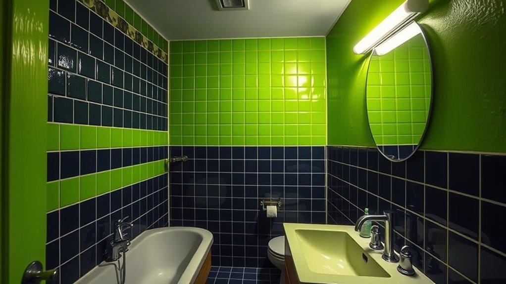
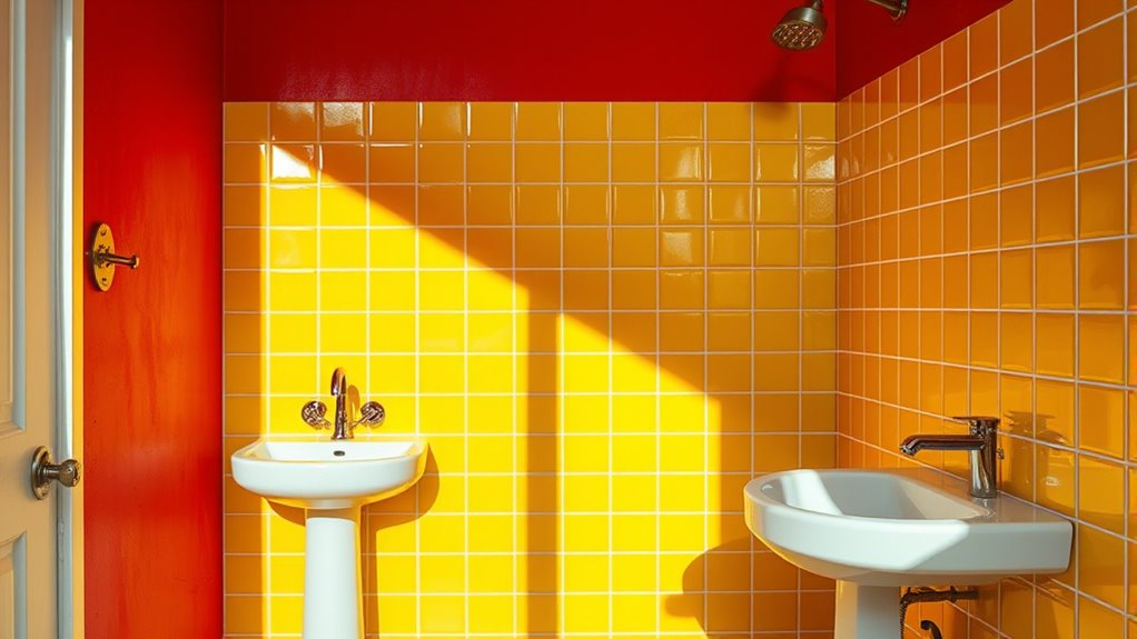
Choosing the right bathroom colors can transform your space, but it’s easy to make mistakes that undermine your design. One common error is selecting overly dark or bold hues without considering how they affect visibility and safety. Deep shades like black, navy, or dark brown can make your bathroom feel smaller and more cramped, but they can also create hazards if they reduce contrast. For example, if your tiles, fixtures, and accessories all blend into the background because of similar dark tones, you might struggle to see where you’re placing your feet or how to navigate safely. This lack of visual differentiation increases the risk of slips, trips, and falls, especially in a space prone to water spills and moisture.
Another mistake is choosing colors that don’t complement the lighting. Bathrooms often have limited natural light, and artificial lighting can cast unflattering or harsh tones. If you pick colors that clash with your lighting setup, it’s not just an aesthetic issue — it can also impair your ability to see clearly. For instance, if your lighting has a cool, bluish hue and you paint your walls a warm yellow or beige, it might create glare or cause misjudgments about the cleanliness or condition of surfaces. Conversely, overly warm or yellowish tones under bright lighting can make the space seem dingy or dirty, which can cause discomfort and reduce your overall sense of safety.
Choosing colors that clash with your bathroom lighting can impair visibility and create unflattering glare.
Color contrast is essential for safety, especially for individuals with visual impairments or age-related vision changes. Using monochromatic or very similar shades for walls, floors, and fixtures can make it difficult to distinguish between different surfaces or objects. For example, if your toilet, sink, or shower blends into the wall color, you might accidentally bump into or trip over them. Bright or contrasting colors around edges, steps, and fixtures help create visual cues that guide your movement and prevent accidents. Ignoring this principle not only compromises style but also makes your bathroom less safe for everyone.
Additionally, incorporating high-contrast color schemes can significantly improve overall safety and ease of navigation in your bathroom. Finally, choosing colors that evoke strong emotional reactions or discomfort can affect your confidence in moving around the space. Colors like harsh reds or overly bright hues can cause eye strain or agitation, especially in a space where you need to feel relaxed and secure. If your bathroom’s color palette triggers stress or discomfort, it can distract you from paying attention to potential hazards, increasing your risk of accidents. To keep your bathroom both stylish and safe, pick colors that promote calm, contrast effectively, and enhance visibility, helping you navigate the space confidently and securely.
Frequently Asked Questions
How Can Color Choices Affect Bathroom Safety?
Color choices can markedly impact your bathroom’s safety by affecting visibility and mood. Bright, high-contrast colors help you see fixtures and hazards clearly, reducing slips and falls. Avoid dark or monochromatic schemes that can make it hard to distinguish objects or borders, increasing accident risks. Opt for light, vibrant hues that brighten the space and improve overall visibility, ensuring you can move safely and comfortably.
What Colors Improve Visibility in a Bathroom?
Think of your bathroom as a stage where clarity shines through. Bright, high-contrast colors like white, pale blue, or soft yellow improve visibility, helping you spot hazards easily. These colors symbolize freshness and alertness, ensuring safety. By choosing light, vibrant hues, you create a space that’s not only welcoming but also reduces accidents, especially for those with limited vision or mobility. Bright, clear colors make safety your top priority.
Are There Color Schemes to Avoid for Safety Reasons?
Yes, you should avoid dark, monochromatic, or overly muted color schemes in your bathroom. These can diminish visibility and increase the risk of slips or falls, especially when lighting is poor. Bright, contrasting colors and well-lit spaces help you see clearly and navigate safely. Stick to light, vibrant hues and guarantee your lighting is sufficient to prevent accidents and create a safe, functional environment.
How Does Lighting Influence Color Perception and Safety?
You might not realize it, but lighting dramatically influences how you perceive bathroom colors and safety. Bright, well-placed lighting enhances color clarity, reducing slips and accidents by making hazards more visible. Poor or dim lighting, on the other hand, can distort colors and obscure potential dangers, increasing risks. To keep your space safe, confirm your bathroom is evenly lit with natural or high-quality artificial light, helping you see clearly and respond quickly.
What Are the Best Colors for Visually Impaired Individuals?
You should choose high-contrast colors like dark shades against lighter backgrounds to help visually impaired individuals navigate safely. Bright, bold colors such as yellow, white, or orange work well for walls and fixtures, making objects stand out clearly. Avoid using similar or muted tones that blend together, as they can cause confusion. Prioritize clarity and visibility to create a safer, more accessible bathroom environment.
Conclusion
Remember, choosing the right bathroom colors is like walking a tightrope—you need balance to avoid danger. I once painted my bathroom all dark hues, and it felt like stepping into a cave. That mistake made me realize how color impacts safety and mood. Just as a well-lit path guides you safely, thoughtful color choices create a space that’s both beautiful and secure. Don’t let color missteps turn your bathroom into a risky obstacle course.