
To use complex greens and yellows effectively, experiment with blending different color combinations like cobalt blue with yellow or quinacridone gold with green to create luminous, natural shades. Layer transparent glazes for depth and add earthy tones like burnt sienna to deepen greens. Balance transparency with opacity to mimic natural variation and light. Keep exploring how these mixes can bring vibrancy and realism to your artwork—if you continue, you’ll discover even more tips to enhance your palette.
Key Takeaways
- Mix cobalt blue with yellow to create fresh, lively greens resembling natural foliage.
- Add burnt sienna or brown to greens for earthy, organic depth and richness.
- Combine quinacridone gold with green for luminous, complex yellow shades like sunlight filters.
- Layer transparent and opaque paints to build vibrancy and realistic depth in greens and yellows.
- Observe natural variations in light and shadow to select and blend hues that reflect real-world diversity.
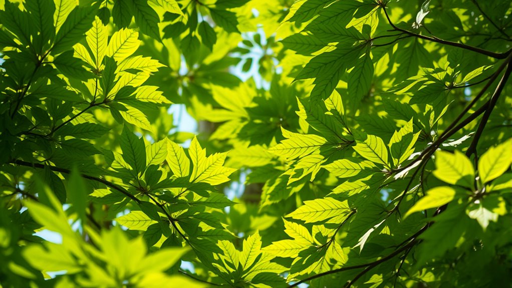
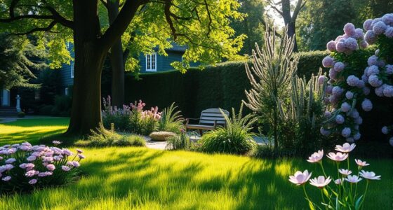
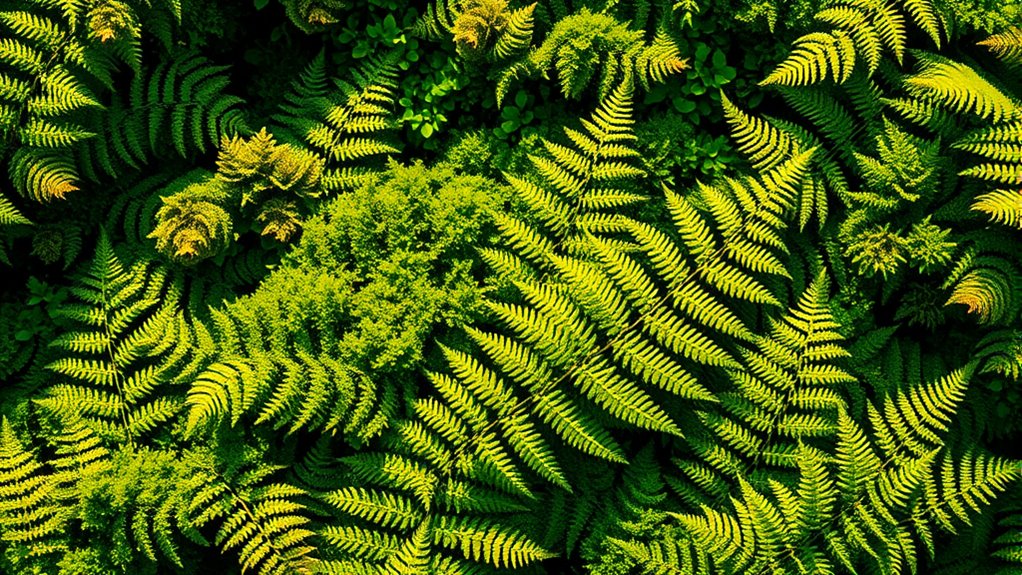
Have you ever wondered how to create vibrant, dynamic artwork using complex greens and yellows? The secret lies in mastering color mixing and understanding natural palettes. When working with these colors, you’re not just blending basic hues; you’re exploring a nuanced spectrum that captures the richness found in nature. The key is to experiment with different combinations, layering shades to achieve depth and vibrancy. For instance, mixing a bit of cobalt blue with yellow can produce a lively, clean green, reminiscent of fresh foliage. Add a touch of burnt sienna or a hint of brown to deepen the green, giving it a more earthy, organic feel. By adjusting the proportions, you can create a range of complex greens that reflect the diversity seen in forests, meadows, and gardens.
Using natural palettes as your guide helps you select colors that harmonize effortlessly. Observe how leaves, grass, and plants feature subtle variations in hue—some are cool and bluish, others warm and yellowish. Incorporate these observations into your palette to make your artwork feel more authentic. For yellows, don’t settle for just primary yellow; try mixing in hints of orange or green to develop complex yellows that add warmth and vibrancy. For example, a touch of quinacridone gold mixed with a hint of green can produce a luminous, complex yellow that glows like sunlight filtering through leaves. The more you experiment with these mixes, the more you’ll understand how to balance brightness and depth, creating lively, eye-catching effects.
In the process of color mixing, pay attention to the transparency and opacity of your paints. Transparent layers can build luminous greens and yellows that shimmer, mimicking the translucence of leaves and petals. Opaque paints can add bold accents or shadows, giving your work a sense of dimension. Remember, working with natural palettes isn’t about copying nature exactly; it’s about capturing its essence through thoughtful color choices. Use your palette to reflect the subtle variations and complexity in natural light, shadows, and textures. This approach will elevate your artwork from simple color application to a vibrant portrayal of nature’s richness. When you understand how to blend and layer these complex greens and yellows, you’ll find yourself creating artwork that feels alive, dynamic, and true to life.
Frequently Asked Questions
How Do I Mix Complex Greens and Yellows Effectively?
To mix complex greens and yellows effectively, focus on color harmony and color temperature. Start with a base green and add small amounts of yellow, adjusting until you achieve the desired hue. Keep the temperature in mind—warm yellows create vibrant, lively greens, while cooler yellows produce more subdued tones. Mix gradually, and test your colors frequently to maintain balance and harmony in your palette.
What Tools Are Best for Blending These Colors?
You’ll want to use soft, synthetic brushes like fan or flat brushes to blend complex greens and yellows smoothly, ensuring good color harmony. Sponges also work well for gentle shifts. When selecting pigments, choose high-quality, transparent hues for vibrant mixes. By carefully blending with these tools and thoughtful pigment selection, you create seamless color gradations and vibrant greens that enhance your artwork’s overall harmony and depth.
Can These Colors Be Used for Digital Art?
Yes, you can definitely use complex greens and yellows for digital art. They enhance your work by enriching color theory and adding depth. Just guarantee you maintain palette harmony by balancing these vibrant hues with complementary or neutral tones. Digital tools allow precise blending and layering, so you can experiment easily. This approach helps create visually appealing, harmonious compositions that draw viewers in and convey your artistic vision effectively.
How Do Lighting Conditions Affect These Hues?
Lighting can make or break your hues. You’ll find that color temperature and ambient lighting dramatically influence how these greens and yellows appear. In warm light, they can seem more vibrant and lively, while cool lighting can mute or shift their tones. Keep in mind, changing lighting conditions are like a chameleon—they alter your colors, so adjust your palette accordingly to keep your artwork consistent and eye-catching.
What Are Common Mistakes When Using Complex Greens and Yellows?
You often make mistakes by ignoring color temperature and pigment transparency when using complex greens and yellows. For instance, choosing hues with mismatched temperature can make your colors look off or unnatural. Additionally, not considering pigment transparency might result in muddy or dull areas. To avoid this, pay attention to the warmth or coolness of your greens and yellows, and layer transparent pigments carefully for vibrant, balanced results.
Conclusion
By blending bold blues with beautiful greens and glowing yellows, you create mesmerizing color combinations that catch the eye. Don’t delay—dare to experiment and discover dazzling designs. Remember, mastering complex greens and yellows makes your artwork more vibrant and valuable. So, stay spirited, stay inspired, and let your creativity flow freely. With a bit of bravery and a splash of boldness, you’ll produce powerful, palette-perfect pieces that truly pop.