
Understanding neutral color psychology helps you see how shades like beige, gray, white, and taupe create calming, harmonious spaces. These tones evoke feelings of peace, stability, and clarity, making environments more relaxing and inviting. Neutral colors serve as versatile backgrounds that support personal expression through accents or artwork, enhancing emotional well-being. By exploring how these hues influence perceptions and mood, you can design spaces that promote calmness and balance—discover more about their subtle effects as you continue.
Key Takeaways
- Neutral colors evoke calm, stability, and sophistication, creating environments conducive to relaxation and focus.
- They serve as versatile backgrounds that promote harmony and reduce visual clutter in interior design.
- Well-balanced neutrals foster feelings of peace, comfort, and grounding, influencing emotional responses subtly yet profoundly.
- Neutral tones act as a blank canvas, allowing vibrant accents that enhance positive emotions like joy and inspiration.
- Understanding color harmony and nuances in neutrals helps design spaces that support emotional well-being and desired moods.
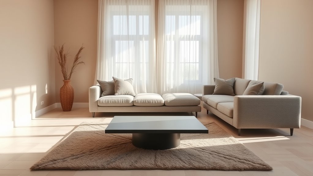
Neutral colors, often seen as understated and calming, play a powerful role in shaping emotions and perceptions. When you incorporate these tones into your environment or design, you create a foundation that influences how people feel and interact within a space. One of the key aspects of working with neutral colors is achieving color harmony. Because neutral shades like beige, gray, white, and taupe are versatile and unobtrusive, they blend seamlessly with other hues, allowing you to craft a balanced and cohesive look. This harmony isn’t just about aesthetics; it impacts emotional responses, too. When your surroundings feature well-balanced neutral tones, they tend to evoke feelings of tranquility, stability, and sophistication. These colors don’t overpower; instead, they set a subtle backdrop that encourages relaxation and focus.
You might notice that neutral colors are often used in spaces meant for calm and concentration—such as offices, bedrooms, or meditation rooms—because they foster emotional responses of peace and comfort. By carefully selecting neutral shades that complement each other, you can create an environment that feels both inviting and refined. This thoughtful color harmony helps to avoid visual clutter and creates a sense of order, which in turn can reduce stress and improve mood. When you understand how neutral tones influence emotional responses, you realize their power to subtly guide behavior and perceptions. For example, a room painted in soft gray or warm taupe can make you feel grounded, while crisp white can evoke clarity and freshness. The key is to contemplate the emotional associations tied to each neutral hue and how they work together to shape the overall atmosphere.
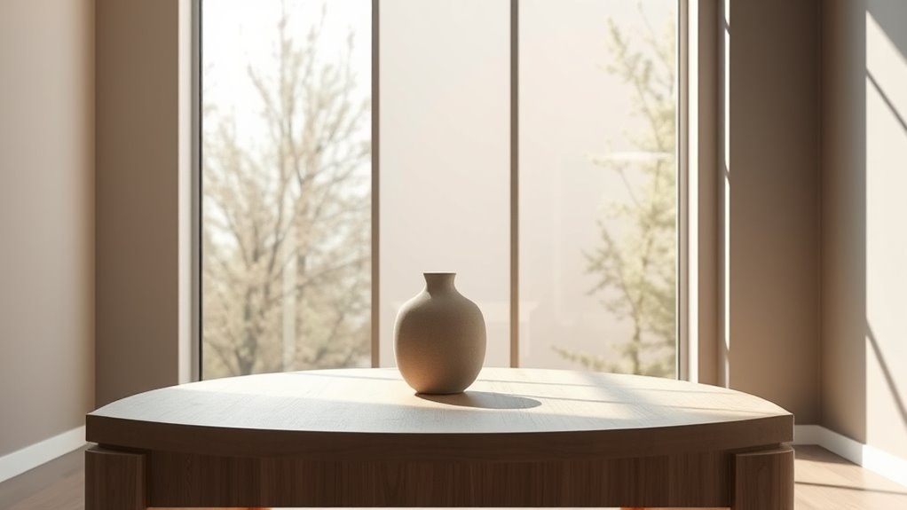
Neutral colors also act as a blank canvas for personal expression. They allow you to add pops of color through accessories or artwork without disrupting the overall harmony. When you balance neutral tones with vibrant accents, you can create a space that feels lively yet balanced—supporting positive emotional responses like joy and inspiration. Understanding this interplay between neutral color psychology and emotional responses helps you make more intentional choices in your decor, branding, or personal style. Additionally, being aware of color harmony principles can help you select shades that promote desired emotional outcomes. The subtle power of neutral hues lies in their ability to influence perceptions gently but profoundly, fostering environments that promote calm, clarity, and emotional well-being. Whether you’re designing a room or selecting an outfit, embracing the nuances of color harmony in neutral palettes can profoundly shape how you and others experience the space.
Frequently Asked Questions
How Do Neutral Colors Influence Mood and Behavior?
Neutral colors influence your mood and behavior by evoking calming emotional responses and creating a balanced environment. They tend to reduce stress and promote relaxation, making you feel more at ease. These colors also have environmental effects, helping to make spaces feel more open and inviting. By using neutral tones, you can foster a peaceful atmosphere that encourages focus and comfort, positively impacting your overall well-being and interactions.
Are Neutral Colors Suitable for Small Spaces?
Yes, neutral colors are perfect for small spaces because they create a sense of openness and calm. Using neutral tones in your color coordination and interior design helps make the room appear larger and less cluttered. Light shades reflect more light, enhancing brightness, while their versatility allows you to add pops of color through accessories. Overall, neutrals foster a cozy yet spacious feel, making your small space more inviting.
Can Neutral Colors Be Combined Effectively With Bold Hues?
Yes, you can definitely combine neutral colors with bold hues effectively. Use complementary color schemes to create striking contrasts, making your space lively without overwhelming it. With neutral color pairing, you balance the boldness of vibrant accents like red or teal, highlighting their energy. Just guarantee the neutral tones serve as a backdrop, allowing the bold hues to stand out while maintaining harmony and visual interest in your room.
What Cultural Differences Exist in Neutral Color Perception?
You’ll find that cultural differences greatly influence how neutral colors are perceived. In some regions, neutral shades like beige or gray are seen as sophisticated and calming, while in others, they might be associated with mourning or simplicity. Regional color preferences shape these perceptions, so understanding cultural color associations helps you select neutral hues that resonate positively across diverse audiences and avoid unintended interpretations.
How Do Neutral Colors Impact Product Branding and Marketing?
Neutral colors impact your product branding and marketing by creating a sense of color consistency, which helps build strong brand recognition. They evoke feelings of sophistication, simplicity, and reliability, making your products more appealing to a broad audience. Using neutral tones strategically can make your brand appear timeless and versatile, encouraging customer trust and loyalty. Ultimately, thoughtful use of neutral colors enhances your overall branding strategy and strengthens your market presence.
Conclusion
By understanding neutral color psychology, you can create spaces that evoke calmness and balance. Did you know that 62% of consumers feel more relaxed in neutral-colored environments? Incorporating these hues thoughtfully can influence mood and perception, making your surroundings more welcoming and soothing. So next time you’re choosing colors, remember how powerful neutral tones can be in shaping feelings and experiences—it’s all about creating harmony and comfort in your space.