Decorating with balanced patterns means creating harmony by pairing bold and subtle designs thoughtfully. Start with a dominant pattern to anchor the space, then add smaller, complementary patterns to bring visual interest without chaos. Use a consistent color palette to tie everything together and distribute visual weight evenly across the room. Incorporate symmetry to guide the eye naturally and maintain cohesion. Continue exploring these tips to master achieving a lively yet harmonious look.
Key Takeaways
- Start with a dominant pattern to anchor the space and build around it with smaller, complementary designs.
- Balance bold patterns with subtle ones across different areas to maintain visual harmony.
- Use a consistent color palette or shared hues to unify diverse patterns and create cohesion.
- Distribute visual weight evenly by balancing patterns with accessories, artwork, or furniture on opposite sides.
- Incorporate visual symmetry and scale contrast to ensure a lively yet balanced and inviting environment.

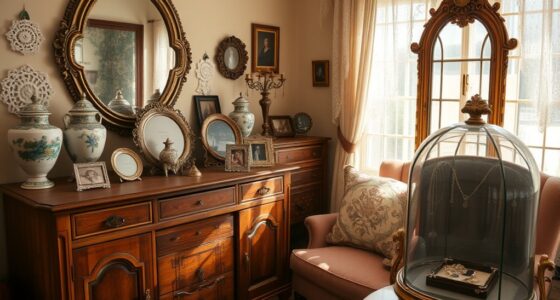
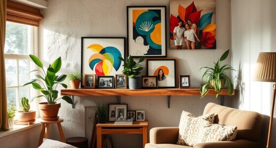
When decorating with balanced patterns, you create a harmonious and visually appealing space that feels both intentional and inviting. Achieving this balance involves understanding how to blend different patterns through careful pattern mixing. Instead of overwhelming the eye, your goal is to create a cohesive look by pairing patterns that complement each other. Think of pattern mixing as a conversation between designs—each one should stand out on its own but work together to form a unified whole. To do this effectively, start with a dominant pattern that anchors the space, then introduce smaller or subtler patterns to add variety without chaos. This approach prevents your room from feeling cluttered and helps you maintain visual symmetry, which is key to balanced decorating.
Visual symmetry isn’t about making everything identical but about distributing visual weight evenly throughout your space. For instance, if you have bold, patterned pillows on one side of your sofa, balance them with similarly styled accessories on the opposite side. Symmetry guides the eye smoothly from one part of the room to another, creating a sense of stability. When you combine patterned curtains with a patterned rug, keep the color palette consistent or overlapping to reinforce visual harmony. Using symmetrical arrangements—such as matching lamps, mirrors, or artwork—further enhances this sense of order, making the space feel thoughtfully curated rather than haphazard.
In pattern mixing, paying close attention to scale is essential. Large, bold patterns can dominate a room, so pair them with smaller, more delicate designs. For example, if your wallpaper has a big floral pattern, choose throw pillows with a tiny floral or geometric print. This contrast creates visual interest without disrupting the overall balance. Additionally, consider the color scheme when mixing patterns; sticking to a limited palette helps different patterns coexist peacefully. You don’t need every pattern to match perfectly, but they should share at least one common hue or tone to tie everything together. This subtle coordination fosters visual symmetry and keeps the room feeling unified.
Furthermore, incorporating visual symmetry in your pattern choices helps to create a balanced and harmonious environment that appeals to the eye. Finally, remember that balance isn’t about symmetry in every element but about creating a visual flow that feels natural and intentional. As you experiment with pattern mixing, step back periodically to assess how the patterns interact and adjust accordingly. Your eye should move comfortably across the space, with no one element overpowering the rest. By thoughtfully balancing patterns and maintaining visual symmetry, you craft a room that feels lively and dynamic yet cohesive and well-ordered. This approach ensures your decorated space is both visually stimulating and inviting, reflecting your curated sense of style.
Top picks for "decorat balanc pattern"
As an affiliate, we earn on qualifying purchases.
Frequently Asked Questions
How Do I Choose the Right Colors for Balanced Patterns?
To choose the right colors for balanced patterns, consider color contrast and mood setting. Opt for harmonious hues that complement each other, creating a sense of balance. Use contrasting shades to add visual interest without overwhelming the space. Think about the mood you want to evoke—calm, energizing, or cozy—and select colors accordingly. This approach guarantees your patterns are visually appealing and evoke the desired atmosphere in your room.
Can Balanced Patterns Work in Small Spaces?
Did you know that small spaces benefit from 60-70% of solid colors? Yes, balanced patterns can work in small spaces if you choose the right pattern scale. Opt for smaller, subtle patterns to maintain visual harmony without overwhelming the area. Using larger, bold patterns might clutter the space. Keep pattern scale in mind, and you’ll create a balanced look that feels cozy and inviting.
What Are Common Mistakes to Avoid With Balanced Patterns?
To avoid common mistakes with balanced patterns, focus on pattern scale to prevent overwhelming your space. Don’t ignore symmetry balance, which helps create harmony; mismatched scales or asymmetry can disrupt visual flow. You might also overuse patterns, making the room feel chaotic. Instead, combine different but complementary patterns thoughtfully, maintaining a sense of balance. Keep your patterns proportionate and symmetrical where needed, ensuring your space feels cohesive and inviting.
How Do I Mix Different Pattern Styles Successfully?
When mixing different pattern styles, you should focus on pattern contrast and scale harmony. For example, if you pair a bold, large-scale floral with delicate stripes, the contrast creates visual interest. Keep the scale balanced—avoid overwhelming the space with tiny patterns or giant prints. Use a unifying color palette to tie everything together, making the mix look intentional and cohesive rather than chaotic.
Are There Specific Furniture Styles That Complement Balanced Patterns?
You should choose furniture styles that promote decor harmony when working with balanced patterns. Opt for clean-lined, simple pieces like modern or Scandinavian furniture to let your patterns stand out without overwhelming the space. These styles create a cohesive look, blending well with balanced patterns. Avoid overly ornate or busy furniture, as they can disrupt the harmony. Focus on maintaining a unified aesthetic to keep your room feeling balanced and inviting.
Conclusion
So, after all this talk about perfect balance, it turns out you’re supposed to keep things interesting, not boringly uniform. Who knew that mixing patterns with a bit of chaos actually creates harmony? Ironically, aiming for absolute symmetry might just make your space feel dull. So go ahead—embrace those mismatched cushions and clashing prints. After all, a little imbalance might just be what makes your home truly stand out.