Using burnt orange and earthy reds creates a warm, inviting space full of depth and seasonal charm. Pair these hues with soft beiges, warm grays, or deep browns to ground your design. Incorporate natural textures like wood or woven fibers and add accents of metallics for a touch of elegance. Play with color layering and contrasting shades to create richness and dimension. To discover more ways to use these versatile colors effectively, explore the ideas that follow.
Key Takeaways
- Combine burnt orange with earthy reds in decor to create warm, inviting spaces inspired by fall and natural elements.
- Use burnt orange as accent pieces like pillows or rugs, pairing with earthy reds on feature walls or furniture for depth.
- Balance these hues with neutral tones and metallic accents to prevent overstimulation and add sophistication.
- Layer different shades of burnt orange and earthy reds for visual interest and dimension in your design.
- Incorporate natural textures like wood and woven fibers to enhance the earthy, cozy vibe of these warm color palettes.
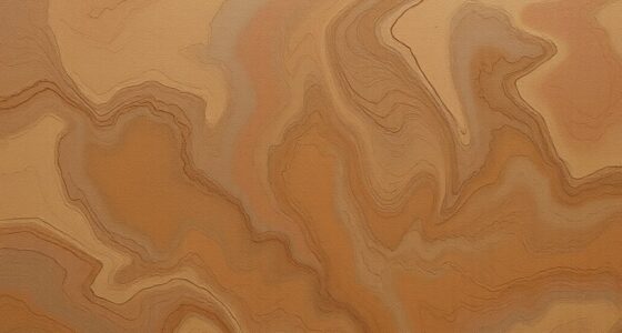
Burnt orange and earthy reds create a warm, inviting palette that adds depth and richness to any space or design. These hues evoke feelings of comfort and nostalgia, making them ideal choices for creating a cozy atmosphere. When you’re working with these colors, focus on color pairing to maximize their impact. Pair burnt orange with deep browns or muted tans to ground the vibrancy, or combine earthy reds with soft beiges and warm grays for a more subtle, sophisticated look. This balance ensures your design feels cohesive without overwhelming the senses.
Burnt orange and earthy reds create cozy, inviting spaces through thoughtful color pairing and seasonal inspiration.
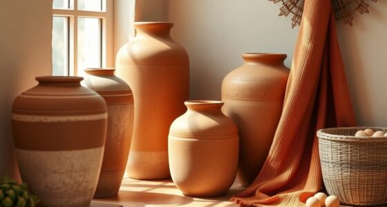
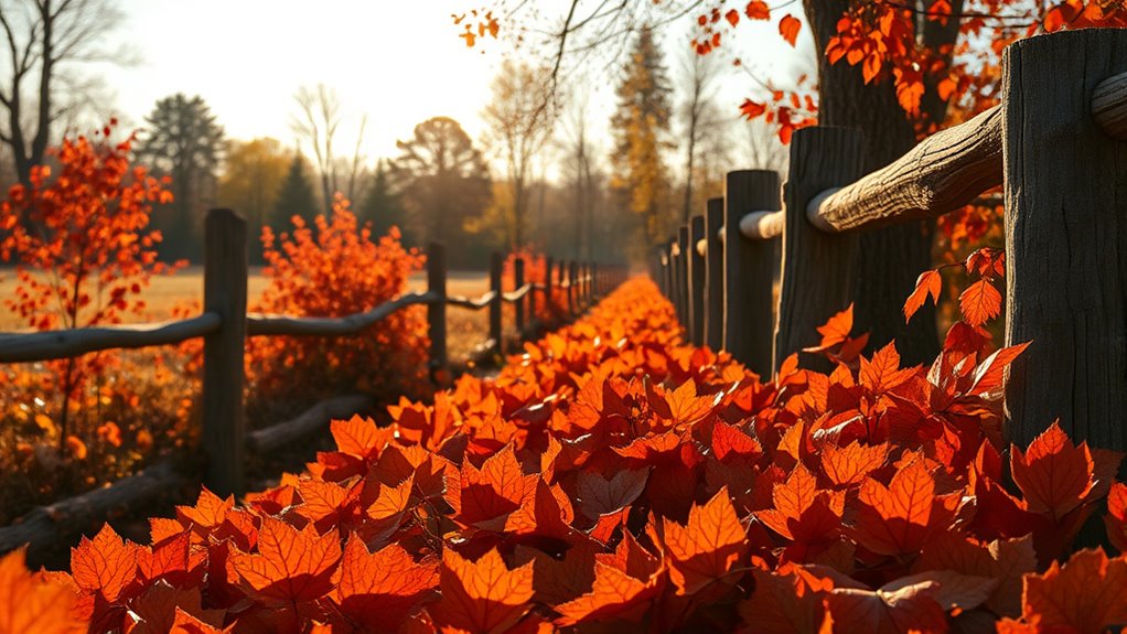
Incorporating these colors into your space can be inspired by seasonal themes, especially fall. The warm tones naturally reflect the changing leaves, providing seasonal inspiration that feels both timely and timeless. Use burnt orange as an accent in throw pillows, curtains, or rugs, paired with earthy reds on feature walls or furniture pieces. Bringing in natural textures like wood and woven fibers enhances the earthy vibe, creating a space that feels organic and well-rounded. You might also consider adding metallic accents like bronze or copper to lend a touch of elegance and warmth, reinforcing the seasonal inspiration behind the palette.
When designing with these colors, think about their emotional resonance. Burnt orange can energize a room, while earthy reds add a sense of stability and comfort. Combining them thoughtfully can create a balanced environment that’s both lively and soothing. For example, in a living room, a burnt orange sofa paired with red-toned artwork or decorative accessories can serve as a vibrant focal point. Complement these with neutral walls and subtle metallics to avoid overstimulation, allowing the warm hues to shine without feeling overwhelming. Furthermore, understanding the impact of color on mood can help you harness these hues to create a space that promotes relaxation or vitality as desired.
Using these colors also opens up opportunities for creative color pairing beyond traditional palettes. Experiment with contrasting shades like teal or navy for a more dramatic effect, especially if you want to add visual interest or a modern twist. Alternatively, layering different shades of these reds and oranges can produce a gradient effect, bringing depth and dimension to your design. Seasonal inspiration can guide your choices: during autumn, lean into richer, deeper reds and oranges, while in spring or summer, opt for brighter, more vibrant variations to keep the look fresh and lively.
Ultimately, working with burnt orange and earthy reds gives you a versatile toolkit to craft spaces that feel warm, inviting, and bursting with character. Whether you’re drawing inspiration from the seasons or simply seeking a cozy, sophisticated aesthetic, mastering color pairing with these hues ensures your design remains dynamic and meaningful.

MIULEE Pack of 2 Couch Throw Pillow Covers 18×18 Inch Soft Burnt Orange Chenille Pillow Covers for Sofa Living Room Fall Home Decor Solid Dyed Pillow Cases
- Package Includes: 2 square pillow covers, 18×18 inches
- Versatile Fit: Fits sofa cushions, beds, chairs
- Decorative Accent: Adds warmth and style to rooms
As an affiliate, we earn on qualifying purchases.
As an affiliate, we earn on qualifying purchases.
Frequently Asked Questions
How Can I Incorporate Burnt Orange Into a Minimalist Decor?
You can incorporate burnt orange into minimalist decor by using it as a subtle accent color. Pair it with neutral tones for a minimalist color pairing that feels balanced. Add burnt orange through small accessories like cushions, vases, or artwork. Use subtle accent techniques such as a single statement piece or a hint of the color in textiles. This creates warmth and visual interest without overwhelming the simplicity of your space.
What Colors Complement Earthy Reds in Fashion Styling?
You can enhance earthy reds in fashion with complementary colors like deep greens, warm tans, and muted browns, following smart color pairing strategies. Incorporate seasonal color palettes by pairing earthy reds with rich, warm hues in fall, or softer, pastel shades in spring. These combinations create harmony and depth, making your outfits stand out. Experiment with layering or accessories to balance the earthy reds and develop stylish, cohesive looks.
Are Burnt Orange and Earthy Reds Suitable for Outdoor Event Themes?
You’ll find burnt orange and earthy reds perfect for outdoor event themes, especially in seasonal color palettes that evoke warmth and vibrancy. Did you know 65% of event planners prefer these colors for outdoor settings? They also carry cultural symbolism linked to harvest and celebration. You’ll feel confident using these hues, as they create inviting, lively atmospheres, blending seamlessly with nature’s backdrop and enhancing the overall ambiance of your outdoor gathering.
How Do These Colors Influence Mood and Ambiance?
Burnt orange and earthy reds influence mood and ambiance creation by evoking warmth, comfort, and energy. These colors stimulate psychological effects that boost excitement and friendliness, making your outdoor event feel inviting and lively. They create a cozy, grounded atmosphere, perfect for fostering social interactions. By choosing these hues, you actively shape a vibrant, welcoming environment that encourages guest engagement and enhances the overall experience.
Can These Hues Be Used Effectively in Small Spaces?
You can absolutely use burnt orange and earthy reds in small spaces. Studies show warm tones can make a room feel more inviting and cozy. To maximize their effect, focus on strategic color placement—like accent walls or accessories—to avoid overwhelming the area. Use these hues sparingly in small space decoration, balancing them with neutral shades to create depth and warmth without sacrificing visual comfort.
Conclusion
By incorporating burnt orange and earthy reds into your space, you create a warm, inviting atmosphere that resonates with nature. Did you know that these colors are proven to boost feelings of comfort and creativity? So, whether you’re decorating a room or choosing clothing, embracing these hues can transform your environment and mood. Start experimenting today—you might just find yourself feeling more inspired and at ease every day.