To encourage wellness in senior living, you'll want to use a mix of colors. Calming blues can create a relaxing atmosphere, while revitalizing greens connect residents with nature. Warm neutrals foster comfort and safety, and energizing reds stimulate appetite and activity. Creative purples inspire artistic expression, cozy browns instill security, cheerful oranges promote social interaction, and soft whites expand space and light. Discover how each color influences well-being and enhances the living experience for seniors.
Key Takeaways
- Calming blues promote relaxation and lower anxiety, making them ideal for bedrooms and leisure areas in senior living environments.
- Refreshing greens connect residents with nature, enhancing comfort, mood, and social interactions in communal spaces.
- Warm neutrals create a comforting atmosphere that reduces visual strain and fosters a sense of belonging among seniors.
- Energizing reds stimulate appetite and social interactions, particularly effective in dining areas and communal settings.
- Uplifting yellows boost mood and cognitive function, creating inviting spaces that encourage engagement and connection among residents.
The Psychological Impact of Color in Senior Living

When you consider the environment of senior living facilities, the choice of color plays a crucial role in shaping residents' emotional and cognitive experiences.
Color psychology reveals that warm colors like red and yellow can stimulate appetite and activity, making them perfect for dining and exercise areas. In contrast, cool colors such as blue and green create a calming effect, ideal for sleeping and healing spaces.
Since colors are processed faster than words, a well-thought-out color palette can help residents, especially those with cognitive impairments, navigate their surroundings more easily.
However, individual reactions to color differ, making it essential to balance personal preferences in senior living design to foster a supportive and uplifting environment.
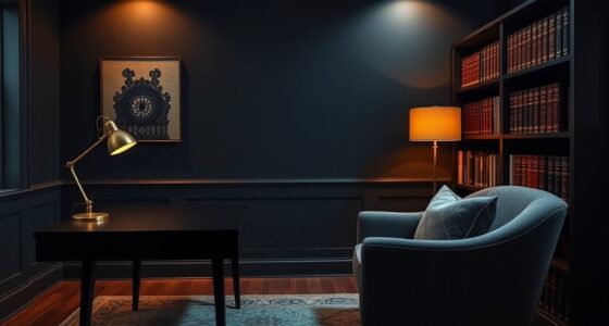
Calming Blues: Creating a Relaxing Atmosphere
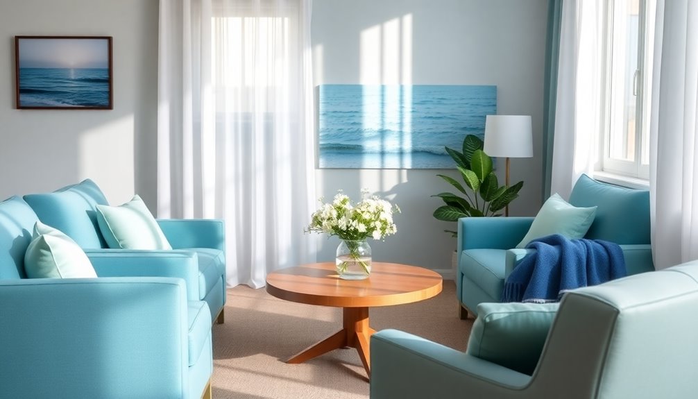
Colors can greatly influence the atmosphere in senior living spaces, and calming blues stand out for their ability to create a serene environment. These soft shades, like sky and light teal, evoke tranquility, making them perfect for promoting relaxation. Research shows these hues can lower blood pressure and reduce anxiety, which is especially beneficial for residents with dementia. Additionally, the concept of emotional alignment suggests that creating a soothing atmosphere can positively impact the overall well-being of seniors.
| Color Shade | Benefits | Usage Example |
|---|---|---|
| Soft Sky | Reduces anxiety | Walls in common areas |
| Light Teal | Promotes relaxation | Throw blankets or cushions |
| Light Blue | Fosters comfort | Dining room ambiance |
Incorporating these calming blues can enhance leisure experiences and create a comforting backdrop, essential for seniors facing cognitive changes.
Refreshing Greens: Connecting With Nature
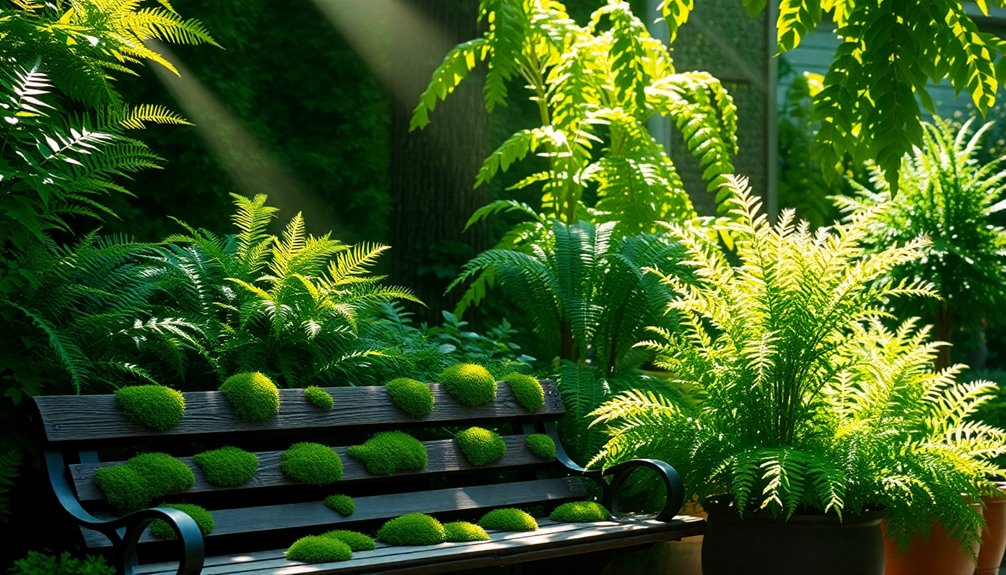
Revitalizing greens bring the essence of nature indoors, creating a soothing environment that enhances seniors' comfort and well-being. Deep and emerald tones not only evoke feelings of harmony but also connect residents with the tranquility of the outdoors. By incorporating greens into communal spaces, you can boost mood and memory, fostering a welcoming atmosphere where seniors love to gather. This versatile color works well in any season, especially for urban seniors who might miss out on natural landscapes. Additionally, strategic lighting can enhance the overall ambiance of these spaces, making them feel even more inviting. Add green accents, like velvet day beds or accent walls, to promote coziness and encourage social interactions. Ultimately, revitalizing greens play an essential role in nurturing a sense of well-being among residents, making them an ideal choice for senior living spaces. Additionally, implementing the "one in, one out" rule can further enhance the effectiveness of these color choices in promoting wellness.
Warm Neutrals: Fostering Comfort and Safety
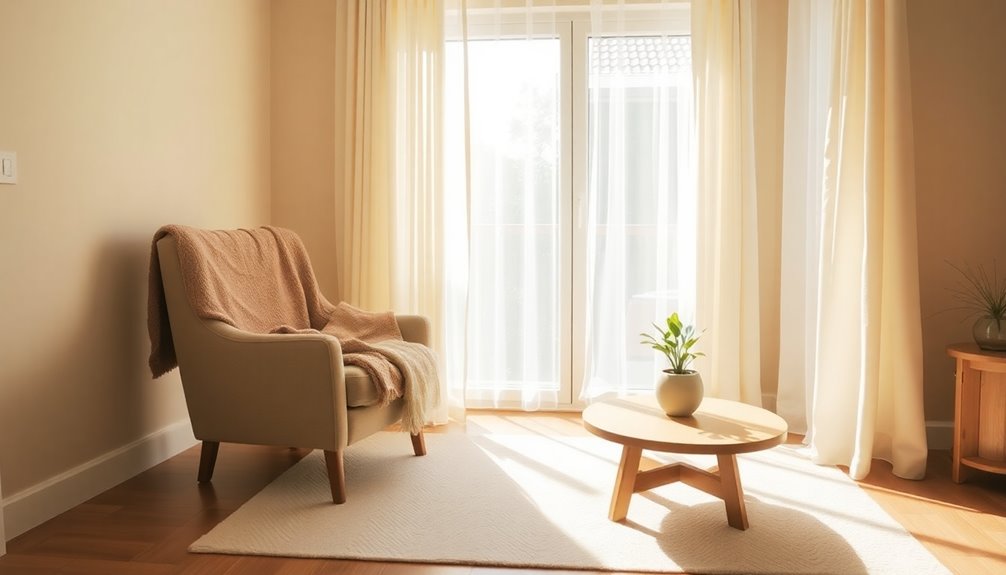
Warm neutrals, like soft beiges and light browns, create a comforting environment that makes you feel safe and at ease. These earthy tones not only promote relaxation but also enhance the versatility of your living space, making it more inviting and visually appealing. Incorporating natural materials like wood can further enhance the warmth and coziness of your surroundings. Additionally, using deter scratching techniques for furniture can help maintain a serene atmosphere by preventing damage from pets. Furthermore, utilizing renewable resources in your home design, such as sustainably sourced wood, can contribute to a healthier living environment.
Comforting Earthy Tones
Creating a cozy atmosphere in senior living spaces often hinges on the choice of colors. Comforting earthy tones, like soft beiges and taupes, invite warmth and safety, making them perfect for your residents. These neutral colors are gentle on aging eyes, reducing strain and enhancing visibility. By incorporating warm neutrals into the design, you can effectively define different areas while maintaining a peaceful environment that promotes relaxation.
Research shows that these tones can boost feelings of belonging and security, especially for those adapting into assisted living. Additionally, aromatic cleaning can help maintain a fresh and inviting space, further enhancing the overall atmosphere. Incorporating essential oils for toothache relief can also provide soothing scents that contribute to a calming environment. Plus, using warm neutral palettes helps lower anxiety and uplift mood, greatly benefiting the overall mental and emotional health of seniors. Furthermore, incorporating natural materials into the design can further enhance the calming atmosphere and contribute to a sense of tranquility.
Embrace these colors to create a nurturing and serene living space!
Safety With Warm Hues
While designing spaces for seniors, incorporating warm hues can greatly enhance their sense of safety and comfort. Warm neutrals, like soft yellows and peach tones, create inviting atmospheres, promoting emotional health and well-being. These colors also counteract lens yellowing that occurs with aging, improving visual comfort. By utilizing warm hues, you can evoke a sense of homeliness, reducing anxiety and fostering familiarity. In common areas, warm neutrals provide a non-intrusive backdrop that encourages social interaction among residents. Additionally, creating a relaxing environment aligns with the importance of relaxation before sleep for better overall wellness. Recognizing the need for emotional health in senior living spaces can further enhance their well-being. Furthermore, incorporating advance directives into the planning of senior living environments can ensure that residents feel secure in their care choices.
| Warm Neutrals | Benefits |
|---|---|
| Soft Yellows | Enhances visual comfort |
| Peach Tones | Reduces anxiety |
| Creamy Beiges | Fosters social interaction |
Neutral Palette Versatility
Neutral color palettes offer remarkable versatility, especially when you're aiming to foster comfort and safety for seniors.
Warm neutrals, like soft beiges and creams, enhance well-being by creating inviting spaces that feel less sterile. Incorporating self-care practices into daily routines can further improve seniors' emotional health. Additionally, smart lighting solutions can further enhance the warmth and adaptability of these neutral spaces.
Here are four key benefits of using a warm neutral palette:
- Reduces Visual Strain: Gentle tones are easier on aging eyes, promoting relaxation.
- Evokes Familiarity: Warm neutrals create a homelike atmosphere that helps seniors feel a sense of belonging.
- Versatile Backdrop: These colors allow you to add vibrant accents, stimulating cognitive engagement without overwhelming senses.
- Promotes Relaxation: Warm neutrals can greatly reduce anxiety, making them ideal for both common areas and personal spaces.
Incorporating expert advice on color selection can further enhance the living environment, supporting seniors' overall well-being.
Embrace these colors for a comforting environment that supports seniors' overall well-being!
Energizing Reds: Stimulating Appetite and Activity

Energizing reds can greatly enhance the dining experience for seniors, stimulating both appetite and activity. This vibrant color is known to increase heart rate and excitement, making it an effective choice for dining areas.
Incorporating bright red tablecloths or window accents in breakfast nooks can combat sluggishness, especially during winter months. Full red walls in communal spaces boost energy and encourage social interactions among residents.
You'll often find red used in restaurant settings to stimulate appetite, proving its effectiveness in food-related environments. While careful use of energizing reds can create an inviting atmosphere, it's important to avoid overusing them to prevent potential agitation among residents.
Balancing this color thoughtfully can lead to a lively and enjoyable dining experience.
Uplifting Yellows: Enhancing Mood and Joy
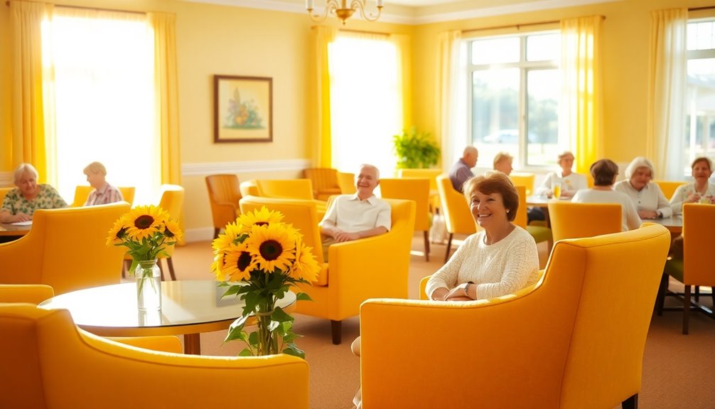
Uplifting yellows can greatly boost your mood and create a bright, inviting space in senior living areas.
These cheerful hues not only foster warmth and joy but also help combat winter sluggishness.
Just remember to choose softer shades for comfort, ensuring a happy atmosphere without overwhelming anyone.
Mood-Boosting Effects
When it comes to enhancing mood and joy, incorporating uplifting yellows into senior living spaces can make a significant difference.
These mood-boosting colors promote happiness and foster emotional well-being among residents. Here are four ways yellow shades can positively impact your community:
- Boosts Energy: Yellow hues stimulate mental activity, helping seniors feel more alert and engaged.
- Encourages Social Interaction: Bright yellows can create an inviting atmosphere that sparks conversations and connections.
- Enhances Appetite: Exposure to yellow can increase energy levels and appetite, making dining experiences more enjoyable.
- Reduces Isolation: Soft yellow tones create warmth, helping to alleviate feelings of loneliness and isolation.
Bright Spaces Creation
Bright colors, particularly shades of yellow, play an essential role in creating inviting and cheerful environments in senior living spaces. Uplifting yellows are known to boost energy levels and promote happiness, making them perfect for dining areas and activity rooms where social interaction flourishes. Incorporating these vibrant hues can enhance the emotional well-being of residents while encouraging engagement in communal activities. Designers are increasingly exploring ‘10 trending color schemes for aging in place‘ that prioritize comfort and accessibility, ensuring that every element contributes to a nurturing atmosphere. From soft yellows paired with calming blues to warm earth tones, these combinations can transform a space into a haven of relaxation and social connection.
By incorporating bright yellow accents, you can stimulate appetite and enthusiasm during mealtimes. Softer shades of yellow can create a sense of warmth and comfort without being overwhelming, providing reassurance to residents.
Research shows that exposure to yellow tones can enhance cognitive function and mood. Strategically placing these colors in communal spaces encourages positive social engagement, helping to reduce feelings of isolation and foster a vibrant community atmosphere.
Seasonal Considerations
As colder months approach, incorporating shades of yellow into senior living spaces becomes essential for maintaining a joyful atmosphere. Uplifting yellows boost mood and promote happiness, combating the winter blues.
Here are four ways to use yellow effectively in your color scheme:
- Accent Walls: Paint one wall in a soft yellow to create a warm focal point.
- Decorative Accessories: Use yellow cushions and throws to add brightness and comfort.
- Dining Spaces: Incorporate yellow tableware to stimulate appetite and engagement during meals.
- Activity Rooms: Add yellow artwork to enhance cognitive function and social interaction.
These sunny accents not only evoke nostalgia but also help residents feel calm and connected during the colder months.
Creative Purples: Encouraging Artistic Expression
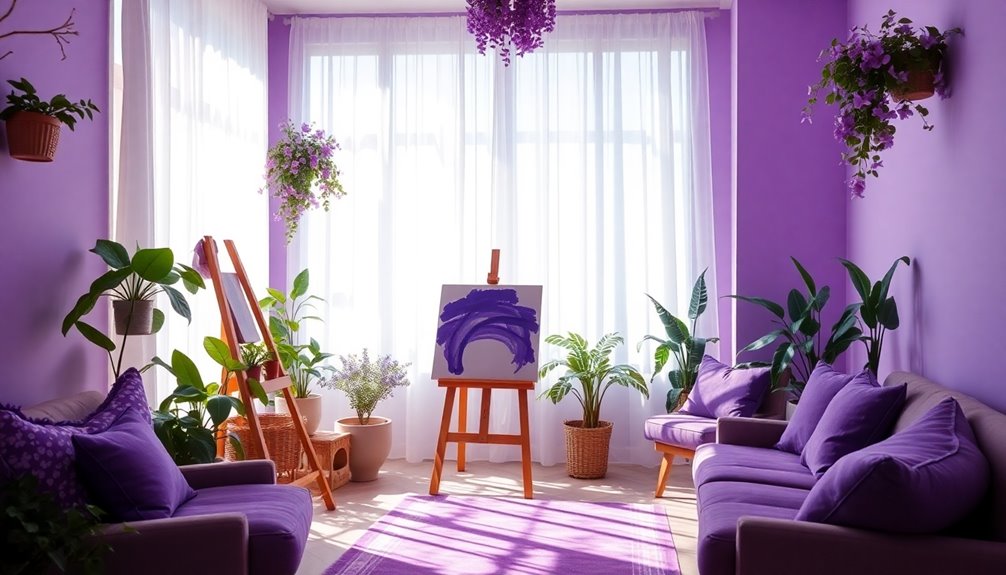
Incorporating creative purples into senior living spaces can ignite artistic expression and inspire residents to explore their creativity. Deeper hues of purple stimulate the creative part of the brain, making them perfect for craft rooms and art studios.
Historically linked to royalty, purple encourages a sense of uniqueness, motivating residents to engage in artistic activities. Adding purple accents in communal areas can foster social interaction and build a sense of community through shared creative experiences.
While light purples might feel chilly in winter, warmer shades guarantee comfort and warmth. Just remember to use these colors in moderation to avoid confusion and isolation in personal spaces like bedrooms, striking a balance between inspiration and tranquility.
Cozy Browns: Instilling a Sense of Security
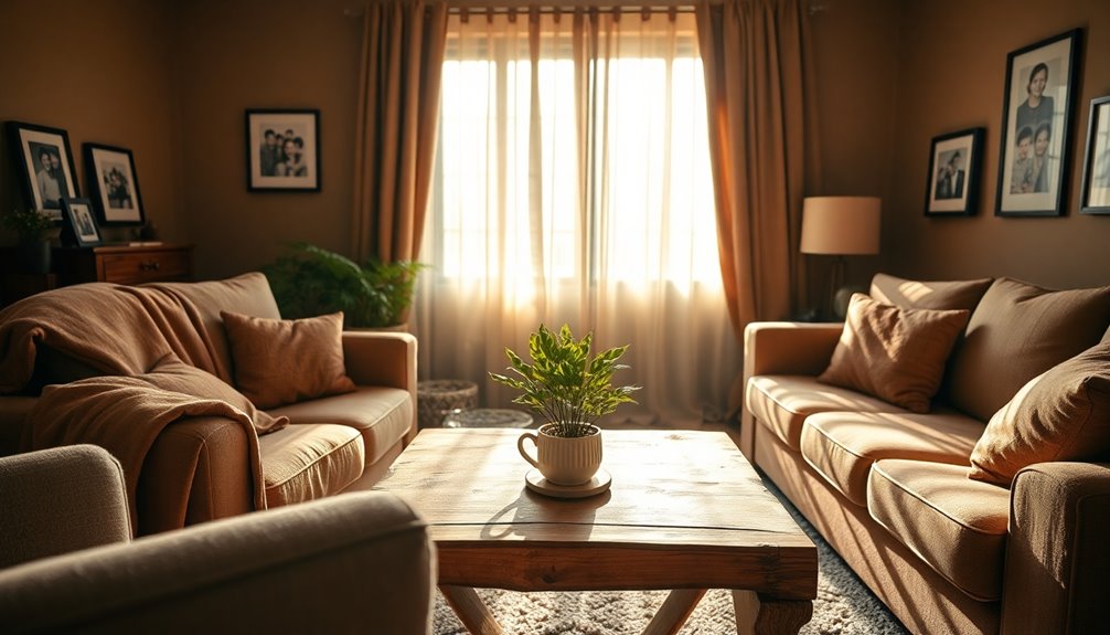
Creative purples can spark inspiration and artistic growth, but to truly cultivate a nurturing environment, cozy browns play an essential role in instilling a sense of security.
These warm tones, like cocoa and chestnut, enhance comfort and reliability in senior living spaces.
Here's how cozy browns can promote relaxation and well-being:
- Accent Pillows: Add brown pillows for tactile comfort, perfect for lounging.
- Shag Rugs: Incorporate shag rugs to create a soft, inviting atmosphere.
- Natural Wood Finishes: Use brown elements in decor to evoke a connection to nature.
- Comforting Decor: Design communal areas with cozy browns to foster gatherings with family and friends.
Cheerful Oranges: Promoting Social Interaction
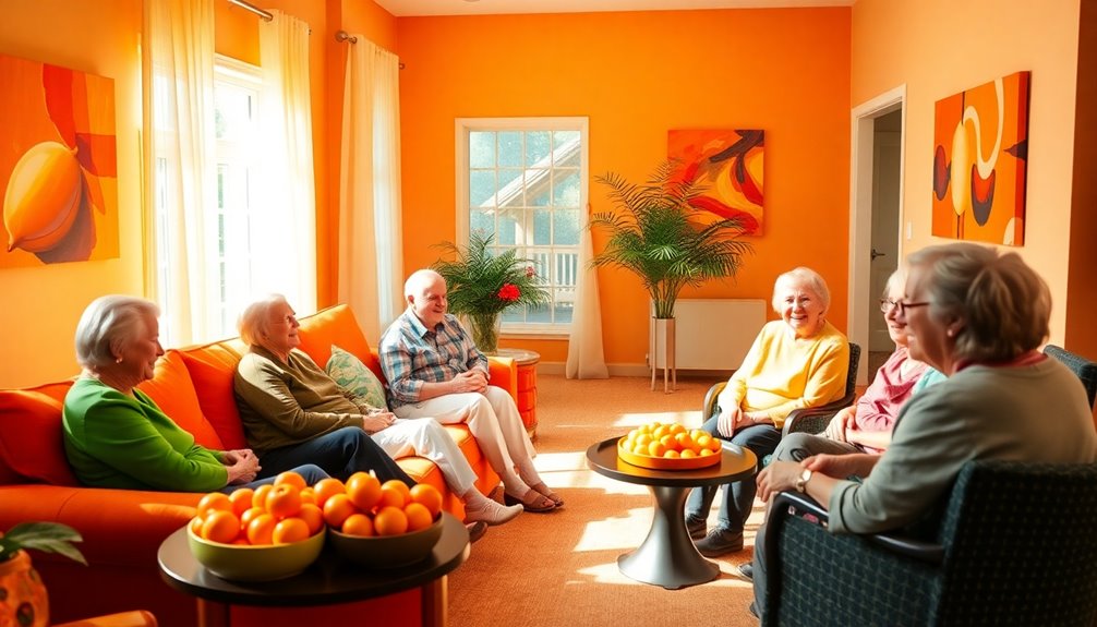
When you introduce cheerful oranges into senior living spaces, you're not just adding color; you're fostering a vibrant community atmosphere. These warm tones stimulate social interaction and enhance mood, encouraging residents to engage in lively conversations and group activities. Incorporating shades of orange through accent walls or furnishings creates an inviting environment. You'll find that using cheerful oranges in dining areas can also boost appetite, motivating residents to gather and socialize during meals. Strategically placing these elements can help reduce feelings of isolation, enhancing overall well-being.
| Area | Purpose |
|---|---|
| Accent Walls | Create inviting spaces |
| Furnishings | Encourage group activities |
| Dining Areas | Stimulate appetite and interaction |
| Activity Rooms | Promote lively engagements |
| Hallways | Brighten paths and connect areas |
Soft Whites: Expanding Space and Light
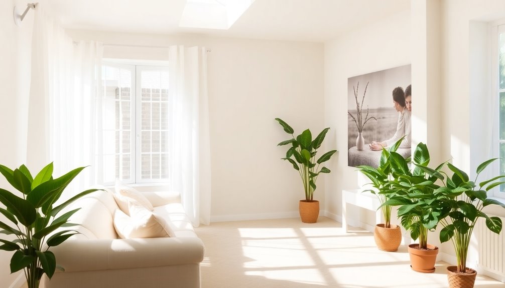
While cheerful oranges bring vibrancy and warmth, soft whites can transform senior living spaces by expanding the perception of space and enhancing natural light.
These gentle hues promote a calming atmosphere that reduces anxiety and fosters well-being among residents.
Here are four key benefits of using soft whites in senior living design:
- Increased Brightness: Reflecting light effectively, soft whites create a brighter environment.
- Mood Enhancement: A soothing backdrop combats feelings of anxiety, promoting relaxation.
- Improved Clarity: Counteracts lens yellowing, enhancing color perception for better navigation.
- Social Connection: Common areas painted in soft whites feel inviting, encouraging social interaction.
Embracing soft whites can make your space more welcoming and supportive for everyone.
Frequently Asked Questions
What Colors Are Best for Elderly People?
When you're choosing colors for elderly people, consider soft blue for calmness in bedrooms, and gentle green to connect with nature, boosting mood and memory.
Warm yellows can energize dining areas, stimulating appetite and social interaction.
Earthy browns create a cozy atmosphere in living rooms, while lavender soothes anxiety, making it perfect for relaxation spaces.
What Color Promotes Health and Wellness?
You might've noticed how certain colors brighten your mood or make you feel calm.
When it comes to promoting health and wellness, soft blues and greens are fantastic for creating a serene atmosphere, reducing anxiety and enhancing relaxation.
Warmer hues like soft yellows and peaches can uplift spirits and evoke comfort.
What Is Color Therapy for the Elderly?
Color therapy for the elderly involves using specific colors to evoke positive emotions and enhance mental well-being.
You'll find that certain hues, like blue and green, can help reduce anxiety and improve mood, while warm colors like yellow and orange can boost appetite and energy.
This therapy considers individual preferences and cultural backgrounds, creating a comforting environment.
What Color Is Easiest for the Elderly to Read?
When you're considering what color is easiest for the elderly to read, think about high-contrast combinations.
Black text on a white background is often the best option, as it enhances visibility. Colors like dark blue or dark green on light backgrounds also improve readability.
Avoid overly bright or clashing colors since they can confuse and discomfort older adults.
For signs, you might use yellow or orange, which stand out well against neutral tones.
Conclusion
Incorporating these colors into senior living spaces can greatly enhance well-being. Did you know that studies show colors like blue can lower blood pressure and stress levels? By thoughtfully choosing hues that promote relaxation, creativity, and social interactions, you can create a nurturing environment that truly supports seniors. So, whether you're redecorating a room or planning a new space, remember the power of color and how it can uplift the spirits of those who live there!