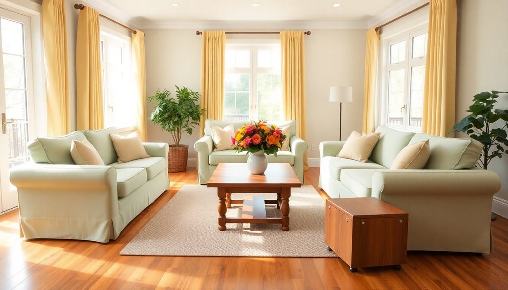
When designing a safe and chic elderly home, color choices matter! Use calming blues and revitalizing greens to create tranquil environments. Warm yellows and peach energize communal spaces, while soft lavenders reduce anxiety. Incorporating familiar colors personalizes the space, creating a sense of belonging. Neutral tones enhance comfort, and vibrant accents stimulate social interactions. Thoughtful patterns can foster a feeling of home. Want to explore more about these essential color choices? There's plenty more to discover!
Key Takeaways
- Use soft blues and greens in bedrooms to create a tranquil environment that reduces anxiety and promotes restful experiences.
- Incorporate warm yellows and peach tones in dining and activity areas to stimulate appetite and encourage social interactions.
- Implement high contrast colors in stairways and doorways to improve visibility and minimize accidents for aging residents.
- Choose neutral colors like beige and soft whites to create a calming backdrop that enhances light and space effectively.
- Add vibrant accents and thoughtful color patterns in communal areas to boost social engagement and foster a sense of community among residents.
The Importance of Color Psychology in Senior Living
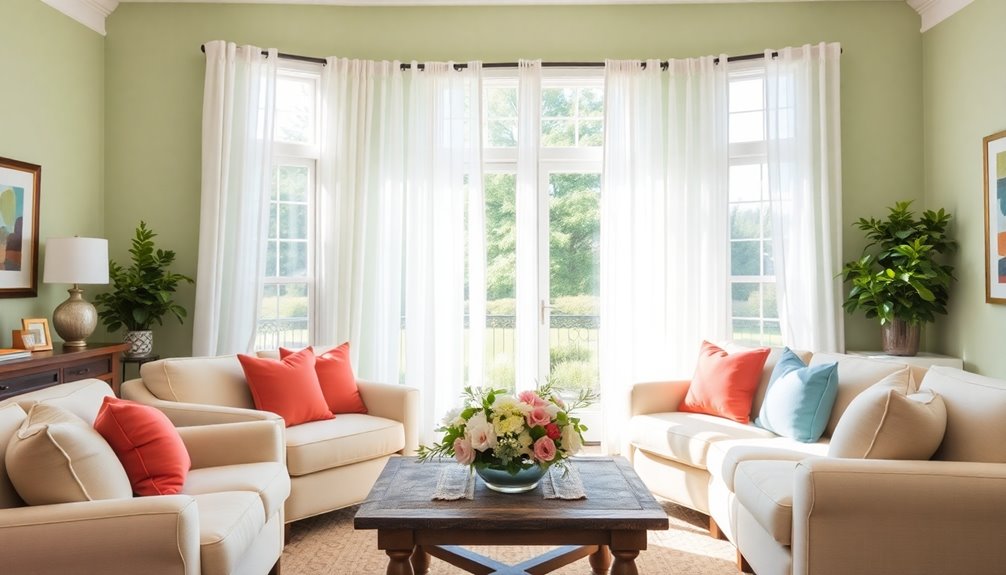
Color psychology is essential in senior living, shaping not just the aesthetics but also the emotional well-being of residents. By understanding how colors and patterns influence mood, you can create a senior living design that promotes comfort and safety. Warm colors like soft yellows and peach can enhance mood, making common areas inviting. Meanwhile, softer blues and greens foster tranquility, significant for residents who may feel anxious. Additionally, using emotional intelligence as a guiding principle in color selection can further enhance the environment. Effective relaxation techniques can also be incorporated into the design to promote a sense of calmness. Neutral colors provide clarity, helping individuals navigate spaces safely. Furthermore, incorporating varying textures alongside color can create a multi-sensory experience that supports overall well-being. This thoughtful approach not only enhances the aesthetic appeal but also aids in wayfinding, reducing confusion for residents. Emphasizing color psychology for senior homes allows for a more holistic design that prioritizes both emotional comfort and functional safety.
Furthermore, using contrasting colors can aid in shape recognition, further enhancing mobility. By carefully selecting colors that cater to individual preferences and cultural backgrounds, you help cultivate a nurturing environment that supports the psychological needs of elderly residents. Effective preparation is key in ensuring that color choices align with the specific needs of residents.
Calming Blues: Creating a Tranquil Environment
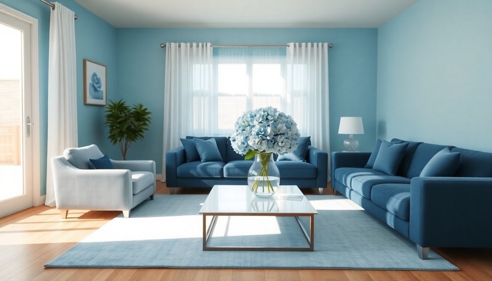
When you choose calming blues for an elderly home, you're not just selecting a color; you're creating a serene atmosphere that promotes relaxation and well-being.
Soft shades of blue can greatly reduce anxiety levels, making them ideal for bedrooms and living areas. To enhance this soothing atmosphere, consider incorporating:
- Light blue walls that invite tranquility.
- Soft blue throw pillows that provide comfort.
- Artwork featuring gentle blue tones for cognitive stimulation. Additionally, establishing clear rules can help foster a sense of security for elderly individuals. Calmer weather conditions during early mornings can also be linked to a more peaceful environment, as reducing external stressors contributes to overall well-being.
These elements work together to form a tranquil environment, encouraging better sleep quality and overall health. Additionally, home improvement strategies can further optimize the space for comfort and safety.
Remember to avoid dark or intense blues, as they can evoke sadness. Instead, stick to lighter variations that foster a peaceful retreat for your loved ones.
Refreshing Greens: Promoting Harmony and Renewal
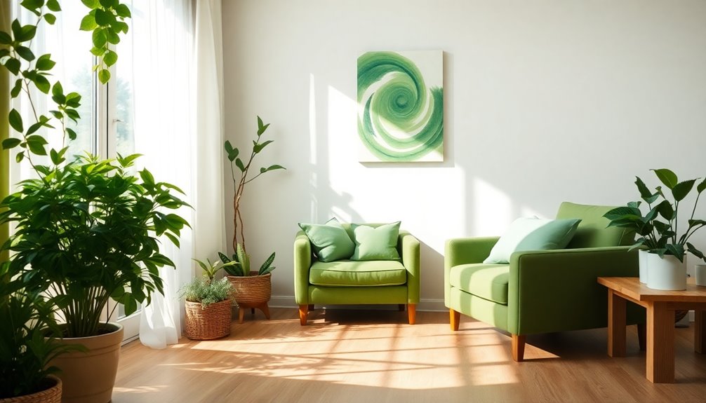
Choosing revitalizing greens for an elderly home can considerably enhance the atmosphere, fostering feelings of harmony and renewal.
The invigorating qualities of soft shades of green create a calming environment that reduces anxiety and promotes relaxation among seniors. Research shows that these hues can improve mood and memory, which is especially beneficial for residents facing cognitive decline. Additionally, burning wood releases harmful pollutants that can exacerbate respiratory issues, making a cleaner environment crucial for overall well-being. Transforming spaces with thoughtful color choices can significantly impact overall well-being and comfort.
Incorporating green elements, like plants or artwork, not only enhances air quality but also connects residents to nature, boosting their well-being. Additionally, using green in communal areas encourages social interaction, fostering a strong sense of community and belonging.
Furthermore, creating a safe and stimulating environment is essential, as it can help managing behavioral issues in seniors, ensuring they feel secure and supported.
Warm Yellows and Peach: Energizing Communal Spaces
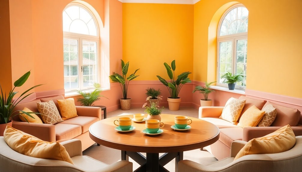
Warm yellows and peach tones create an inviting atmosphere that energizes communal spaces for elderly residents. These warm colors boost energy and optimism, making them perfect for senior living environments.
Consider how these hues can transform your spaces:
- Dining Areas: Bright yellows stimulate appetite and encourage lively conversations, reminiscent of the mindfulness practices often utilized in wellness retreats. Additionally, incorporating heat pumps can help maintain a comfortable temperature, further enhancing the dining experience.
- Activity Rooms: Peach tones foster social interaction, creating a vibrant environment for games and crafts.
- Common Lounges: Soft yellows help reduce agitation, promoting a harmonious setting for relaxation.
Incorporating warm yellows and peach tones not only enhances cognitive function but also nurtures a sense of belonging, essential for residents in care facilities. Additionally, using safe sleep environments can also contribute to overall comfort and well-being for elderly individuals.
Embrace these energizing colors to uplift communal spaces and enrich the lives of your elderly residents.
Soft Lavenders: Reducing Anxiety and Enhancing Relaxation
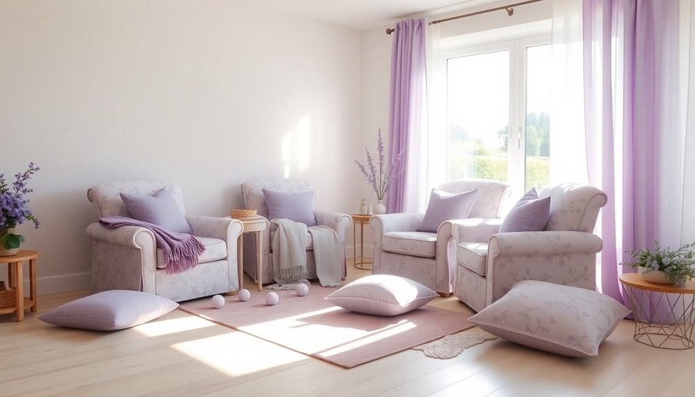
As communal spaces benefit from energizing colors like warm yellows and peach, soft lavenders offer a soothing contrast that can greatly enhance relaxation for elderly residents.
By incorporating soft lavenders into bedrooms and relaxation areas, you create a calming atmosphere that considerably reduces anxiety levels. Research shows that these gentle hues can lower blood pressure and heart rate, contributing to a more peaceful living environment.
Additionally, soft lavenders evoke comfort and nostalgia, fostering a sense of familiarity and belonging among seniors. This serene color not only minimizes overstimulation but also supports emotional well-being, making it an ideal choice for spaces where tranquility is essential.
Embracing emotional regulation through color choices can further enhance the residents' sense of security and stability.
Embrace soft lavenders to cultivate a comforting haven for your elderly residents.
High Contrast Colors: Enhancing Safety for Aging Eyes
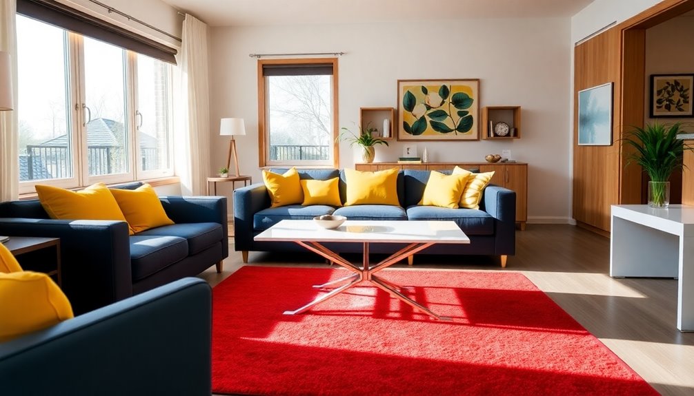
When considering color choices for elderly homes, high contrast colors play an essential role in enhancing safety for aging eyes. They improve visibility, making it easier for seniors to navigate their spaces.
Here are three ways high contrast colors can boost safety:
- Furniture and Walls: Use contrasting colors to help define shapes and boundaries, reducing accident risks.
- Stairs and Doorways: Clear color contrasts in these essential areas prevent trips and falls, enhancing safety.
- Common Areas: Incorporating high contrast colors encourages independence by aiding recognition and orientation.
Personalizing Spaces: Incorporating Familiar Colors
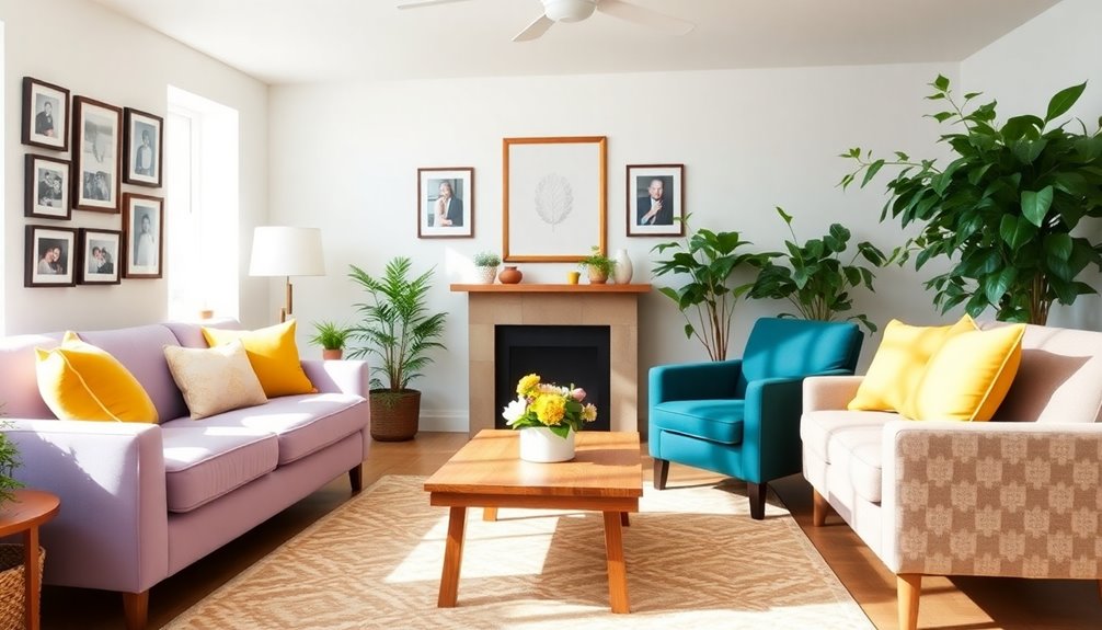
Incorporating familiar colors into elderly spaces not only enhances aesthetics but also deeply impacts emotional well-being. By personalizing spaces with colors that evoke cherished memories, you create an inviting atmosphere that promotes a sense of belonging.
Soft, warm tones like peach or light yellow can provide comfort while accommodating aging eyes. It's vital to reflect individual preferences and cultural backgrounds in your color choices, as these elements contribute greatly to a homely environment.
Utilizing colors associated with positive experiences can alleviate anxiety, especially in memory care settings where emotional stability is imperative.
Strategically incorporating familiar colors in decor, such as artwork and textiles, fosters cognitive engagement and social interaction among residents, enriching their daily lives.
Using Neutrals: Creating Comfort and Clarity
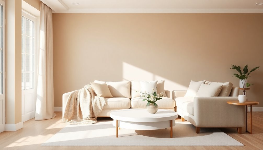
When you choose neutral colors for an elderly home, you balance light and space effectively.
These shades not only enhance visual comfort but also create an inviting atmosphere that promotes relaxation.
Balancing Light and Space
Creating a serene environment in an elderly home often hinges on the smart use of neutral colors. These hues, like beige, gray, and soft whites, provide a calming backdrop that enhances natural light, promoting comfort.
Here's how you can balance light and space:
- Use lighter tones to visually expand smaller areas, making them feel more open and airy.
- Incorporate varied textures through fabrics and finishes to add depth without overwhelming the senses.
- Add personal touches with decor that reflects familiarity, fostering a sense of belonging.
- Additionally, consider using warm color schemes to enhance coziness and create a welcoming atmosphere.
Enhancing Visual Comfort
Neutral colors are essential for enhancing visual comfort in elderly homes, as they provide a calming backdrop that reduces stress and confusion. Color palettes featuring whites, grays, and beiges create a sense of spaciousness and tranquility, countering the sterility of excessive white. By incorporating warm undertones like soft taupes and creamy whites, you can make spaces feel more homely and inviting. These neutral colors serve as a safe canvas for personal touches, allowing residents to express their tastes without overwhelming the environment. Using contrasting neutral shades helps distinguish furniture and fixtures, improving accessibility for aging eyes. Additionally, using filtered water in coffee preparation can enhance the overall experience and comfort for residents who enjoy a warm beverage. Furthermore, a well-organized space with efficient storage strategies can significantly contribute to the overall tranquility of the home environment.
Vibrant Accents: Encouraging Social Interaction
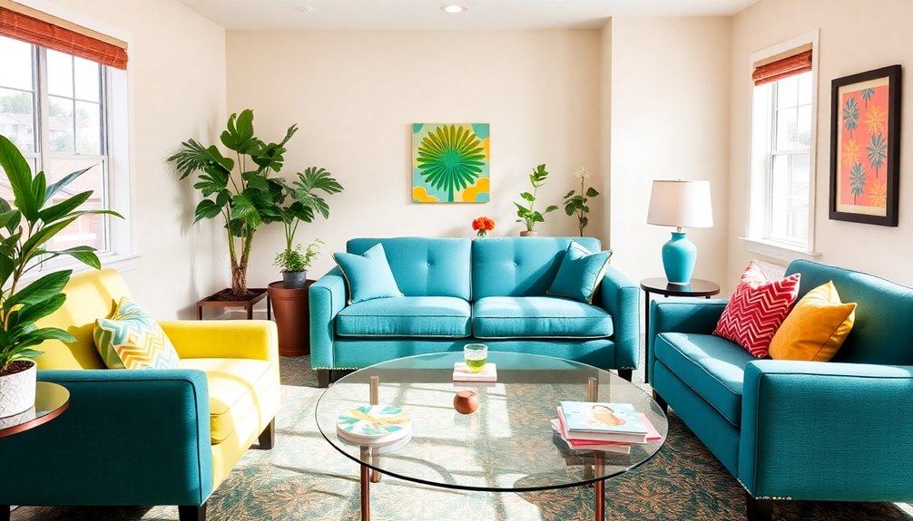
Incorporating vibrant colors in communal spaces can really boost social interaction among residents.
By using warm hues like oranges and pinks, you'll create an inviting atmosphere that encourages connection and lively conversation.
Plus, colorful furniture and decor can help everyone navigate the space more easily, promoting engagement and activity.
Colorful Community Spaces
When you design colorful community spaces for elderly residents, vibrant hues can play an essential role in fostering social interaction. Consider incorporating:
- Warm reds and cheerful yellows that stimulate appetite and create a lively atmosphere.
- Soft blues and greens that promote calmness, encouraging residents to engage comfortably in social activities.
- Pastel tones that evoke feelings of harmony, enhancing community bonding.
Using contrasting colors can help define spaces and pathways, making navigation easier for aging residents.
Additionally, accessorizing with colorful art and decorative items serves as conversation starters, further promoting interaction.
Engaging Activities Through Color
Colors can markedly influence how residents engage in activities, as vibrant accents not only beautify spaces but also invite participation.
By incorporating lively reds and oranges in communal areas, you create an atmosphere that stimulates social interaction and fosters a sense of community. Bold accent colors draw attention, enticing residents to join in discussions and activities, ultimately enhancing their well-being.
Thoughtful use of contrasting colors helps delineate areas for various activities, promoting clarity and encouraging engagement in programs. Sunny yellows and cheerful greens boost energy and positivity, further increasing participation in social events.
The strategic application of vibrant shades serves as a visual cue, promoting interaction and connection among residents, making your home a lively hub of engaging activity.
Warm Hues for Connection
Creating an inviting atmosphere in communal spaces often hinges on the use of warm hues like red, orange, and yellow, which naturally stimulate social interaction.
These vibrant colors can transform your elderly home into an uplifting environment where residents feel a sense of belonging.
Consider incorporating:
- Soft yellow walls to promote calmness and connection.
- Colorful artwork that serves as conversation starters, sparking memories and stories.
- Cozy accent pieces in warm tones that encourage gatherings and shared moments.
Thoughtful Color Patterns: Fostering a Sense of Home
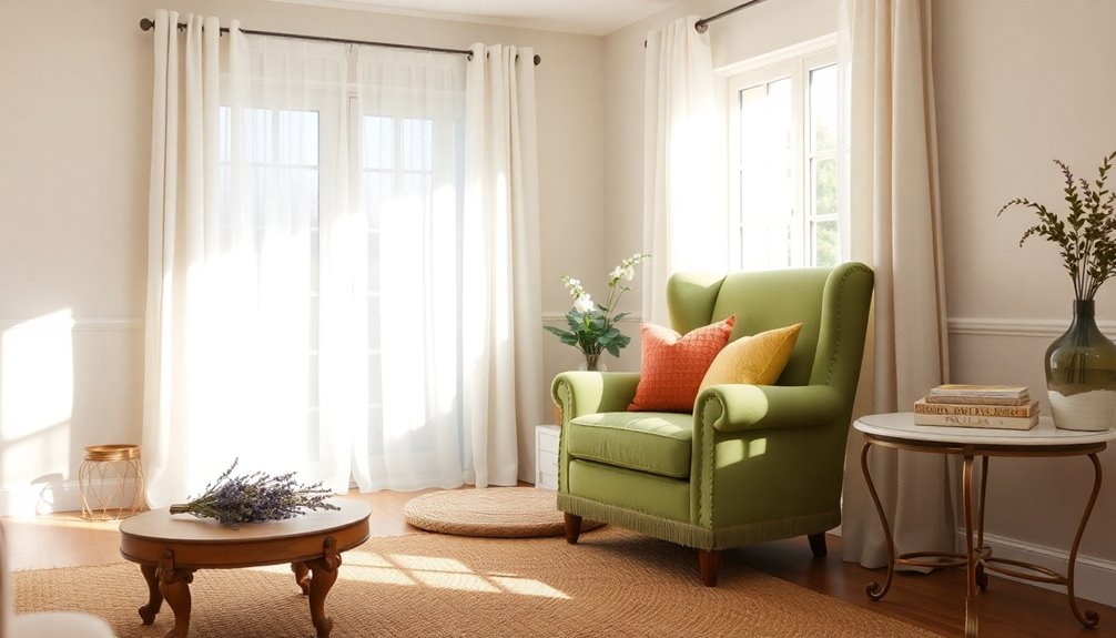
While thoughtful color patterns play an essential role in designing senior living spaces, they also evoke feelings of familiarity and comfort. By incorporating warm tones, like soft yellows and peach, you create an inviting atmosphere that resonates with residents' experiences.
Harmonious colors such as pastels and earth tones foster a sense of peace, enhancing emotional well-being. You can further strengthen the sense of home by adding personal touches—think familiar patterns or cherished memories reflected in decor.
Strategic color choices, like soft blues and greens, not only reduce anxiety but also promote relaxation, especially for those with cognitive impairments. Ultimately, these thoughtful color patterns transform spaces into comforting havens, enriching the lives of elderly residents.
Frequently Asked Questions
What Are the Elderly Friendly Colors?
When choosing elderly-friendly colors, opt for soft, warm tones like peach or soft yellow. These colors provide comfort and enhance visibility for aging eyes.
Cool colors such as light blue and lavender can create a calming atmosphere, reducing anxiety. Earthy greens promote harmony and social interaction in shared spaces.
High contrast combinations, like dark furniture against light walls, improve shape distinction, ensuring safety.
Finally, neutral colors offer a serene backdrop for personalized decor.
What Colors Are Most Desirable in the Décor of a Nursing Home or Senior Living Setting?
When choosing colors for décor in a nursing home or senior living setting, you'll want to focus on warm hues like soft yellows and peaches to create a welcoming atmosphere.
Incorporate cooler shades like blues and greens to promote relaxation. Neutral colors like beige and gray can help make spaces feel inviting.
Additionally, high contrast colors assist those with vision challenges, enhancing their ability to navigate the environment comfortably and safely.
What Colors Do Elderly See Best?
You might think all colors look the same to the elderly, but that's not true. They often see warmer tones, like soft yellows and peaches, more clearly due to natural changes in their vision.
High contrast colors, such as dark against light, help them distinguish shapes better.
Soft hues like lavender or light blue offer comfort, while vibrant colors like red can boost energy, particularly in dining areas.
What Color Is Calming for the Elderly?
When considering calming colors for the elderly, soft blue hues stand out. They help lower blood pressure and reduce anxiety, creating a serene atmosphere.
You might also explore gentle greens, which promote feelings of harmony and renewal.
Lavender and light purple tones enhance relaxation, perfect for bedrooms.
Warm neutrals like soft yellows and peach offer comfort and a homely feel.
Avoid overly bright colors, as they can lead to confusion and agitation.
Conclusion
Incorporating these ten terrific tones into your elderly home can transform the space into a sanctuary of serenity and style. By blending calming blues, revitalizing greens, and warm yellows, you'll create cheerful corners that encourage connection and comfort. Don't forget to add personal touches with familiar shades, ensuring every room radiates warmth and well-being. With thoughtful color choices, you'll foster a fabulous feeling of home, making each day a delightful discovery for everyone.
