
To prevent falls, use contrasting colors and visual cues on floors, stairs, and doorframes. For floors, add rugs or mats with distinct colors or patterns that stand out from the surface. Clearly mark stair edges with bright tape or paint, and ensure handrails are visible through contrasting shades. Paint doorframes in contrasting colors from walls to improve visibility. These simple tweaks can greatly boost safety; explore more ways to enhance your environment below.
Key Takeaways
- Use contrasting colors or patterns on rugs and mats to clearly delineate floor surfaces and prevent trips.
- Paint or tape stair edges with bright, contrasting colors like white or yellow to enhance visibility.
- Highlight doorframes with contrasting paint to make entrances easily distinguishable and avoid misjudgments.
- Incorporate adequate lighting near stairs and doorways to improve overall visibility and safety.
- Add textured or reflective tape on steps and handrails for better grip and increased visibility in low-light conditions.
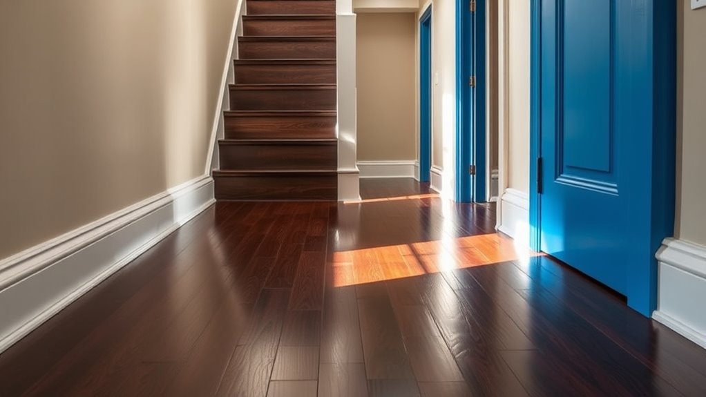
Falls are a common hazard, especially for older adults, but one effective way to prevent them is by enhancing visual contrast in your environment. When your floors, stairs, and doorframes stand out clearly against their surroundings, you’re less likely to trip or misstep. This simple adjustment can make a significant difference in safety and confidence as you move around your home. By paying attention to how different surfaces and edges look, you can better judge distances and avoid dangerous falls. Implementing contrast in lighting can further improve visibility and safety. Start by focusing on your floors. If your carpet, hardwood, or tile floors are all the same color and texture, it can be tricky to tell where one surface ends and another begins. Consider adding contrasting rugs or mats at key transition points, such as doorways or the top and bottom of stairs. These rugs should have a distinct color or pattern that stands out from the floor underneath. For example, if your floor is light-colored, go for a darker, solid-colored rug. This visual cue helps your eyes catch the change in level and prevents you from accidentally stepping where you shouldn’t.
Stairs are another critical area where contrast makes a big difference. Many falls happen on stairs because the edges are hard to see. To improve safety, paint or tape the edges of each step with a bright, contrasting color like white or yellow. This makes each step more visible, especially in rooms with dim lighting or busy decor. You can also add reflective tape or tape with a textured surface to increase visibility and grip. If your stairs have a handrail, ensure it’s clearly visible by painting it a contrasting color or adding a strip of tape along its length. These visual cues guide your eyes and help you judge each step more accurately.
Doorframes often blend into walls, making it easy to misjudge door openings, especially in low-light conditions. To prevent this, paint the doorframe a contrasting color from the wall, such as white or a bright accent color. This makes doorways stand out more clearly, reducing the risk of walking into them or misjudging the space. Additionally, adding lighting near doors and stairways enhances visibility, complementing the contrast and further reducing fall risk.
Incorporating contrast into your environment isn’t complicated or expensive, but it’s a powerful way to enhance safety. By making key features easier to see—whether through color, tape, or lighting—you help your eyes and brain work together to navigate your home more securely. Small changes like these can give you peace of mind and increase your independence, allowing you to move around with confidence and reduce your chances of falling.
Frequently Asked Questions
How Do Color Contrasts Differ for Visually Impaired Individuals?
You’ll find that color contrasts for visually impaired individuals are much more pronounced, making it easier to distinguish between surfaces and edges. Bright, high-contrast colors like black and white or yellow and dark shades help your eyes detect changes quickly. You should use bold, distinct colors for stairs, doorframes, and floors to improve safety. Strong contrasts reduce confusion and prevent accidents, especially in areas with poor lighting or complex layouts.
Are There Specific Color Schemes Recommended for High-Traffic Areas?
For high-traffic areas, you should use bold, contrasting color schemes to enhance visibility and safety. Opt for bright colors like yellow or white against darker backgrounds to clearly mark edges, stairs, and doorframes. Avoid subtle or monochromatic schemes that can cause confusion. Regularly maintain and refresh the paint to keep contrasts sharp, ensuring that everyone, especially those with visual impairments, can navigate safely and confidently.
Can Contrast Be Effective on Textured or Patterned Flooring?
Imagine walking into a busy kitchen and instantly noticing the difference between the tiled floor and the rug—contrast helps your eyes distinguish surfaces. Yes, contrast can be effective on textured or patterned flooring. It highlights changes in surface elevation or pattern, making hazards more visible. For example, a textured tile with a contrasting grout line can guide your steps safely, reducing the risk of slips or trips.
What Are the Best Contrast Colors for Elderly Safety?
You should use high-contrast colors like white and black or bright yellow and dark brown to reinforce visibility for elderly safety. These combinations make edges of stairs, doorframes, and floors stand out clearly, helping you recognize hazards quickly. Avoid subtle or similar shades that blend together. Using bold, contrasting colors ensures you can see changes in elevation and navigate spaces more safely, reducing fall risks effectively.
Are There Materials That Improve Contrast Besides Paint or Color?
Yes, you can use textured materials like rubber, vinyl, or tactile tiles to improve contrast and safety. These materials provide a visual and tactile difference that helps you distinguish edges and surfaces, reducing fall risks. You might also consider using contrasting strips or borders made from different textures or materials, which can be especially helpful on stairs or doorframes. Combining these materials with color contrast enhances overall visibility and safety.
Conclusion
By paying attention to contrast on floors, stairs, and doorframes, you can turn your home into a fortress against falls. Think of contrast as your silent guardian, guiding your steps like a lighthouse in a storm. Don’t let poor visibility be the iceberg that sinks your safety; instead, illuminate your path with high contrast. With these simple changes, you’ll navigate your surroundings confidently, transforming everyday hazards into clear, safe routes.