
Using moody tones in interior design lets you create dramatic and sophisticated spaces that feel both deep and inviting. Choose rich hues like navy, charcoal, or emerald and pair them thoughtfully with lighter accents or crisp whites. Layer different lighting styles—warm bulbs, dimmable fixtures, and natural light—to enhance the emotional impact. The right combination of color and lighting can transform your space into a striking yet cozy retreat. If you want to discover more tips, keep exploring these design strategies.
Key Takeaways
- Choose rich, dark hues like navy, charcoal, or burgundy to create dramatic, sophisticated interiors.
- Balance moody tones with lighter accents, such as white trim or blush accessories, to maintain inviting spaces.
- Use layered lighting—warm bulbs, dimmable fixtures, and spotlights—to enhance depth and emotional impact.
- Incorporate textures and natural light to soften darker colors and add visual interest.
- Experiment with bold color pairings and strategic placement of lighting to achieve a harmonious and stylish atmosphere.
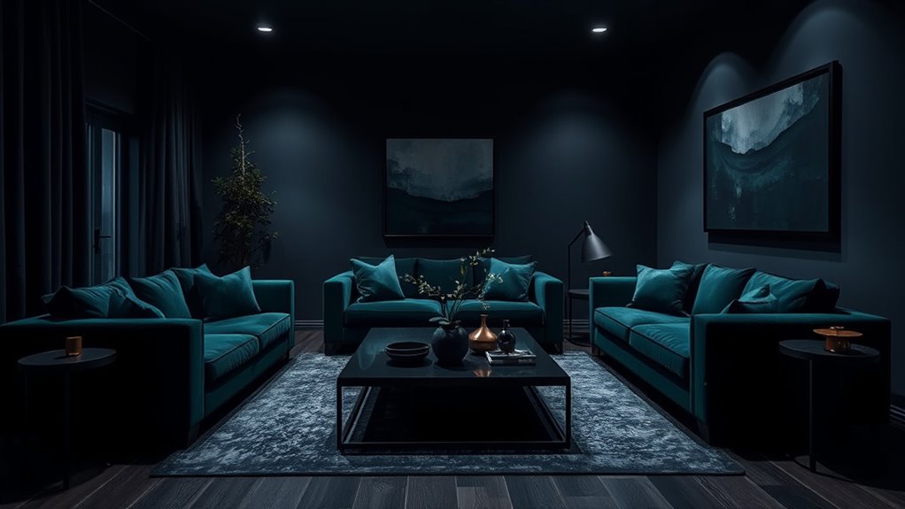
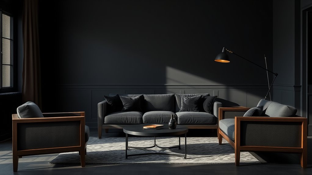
Moody tones have become a popular choice for creating dramatic and sophisticated interiors, especially when you want to add depth and character to a space. These rich, dark shades evoke emotion and lend an air of elegance, but they also require careful consideration to truly shine. To make the most of moody tones, you need to master color pairing and lighting techniques, which work together to balance intensity and warmth.
When selecting colors, think beyond just dark shades. Deep navy, charcoal, forest green, and burgundy can all serve as foundational hues, but they shouldn’t overwhelm. Instead, pair these moody tones with lighter or contrasting colors to keep the space inviting. For example, a charcoal wall can be complemented with crisp white trim or soft blush accents. These lighter hues brighten the room and prevent the darker tones from feeling oppressive. Conversely, you can create a monochromatic scheme by layering different shades of the same color, adding depth without losing the sophisticated vibe. The key is to experiment with bold color pairings that enhance the mood without making the space feel small or closed in.
Lighting techniques are essential when working with moody tones. You want to strike a balance between shadow and light, emphasizing the richness of the colors while ensuring the space feels welcoming. Warm lighting, such as amber or soft yellow bulbs, works well with dark tones because it adds a cozy glow, preventing the room from feeling cold or uninviting. Use layered lighting—combining ambient, task, and accent lights—to highlight architectural features and create visual interest. For example, installing dimmable fixtures allows you to adjust the brightness depending on the mood you want to evoke. Spotlights on artwork or textured wall surfaces can draw attention to the depths of the moody hues, making them appear more vibrant and dynamic.
In addition, consider the placement of your lighting fixtures. Wall sconces or table lamps with warm bulbs can soften the overall atmosphere, while recessed lighting can illuminate darker corners to make the space feel more open. Large windows with sheer curtains can also introduce natural light, balancing the darker tones during the day. The goal is to create a layered lighting scheme that enhances the emotional impact of your chosen colors. By thoughtfully combining color pairing with strategic lighting techniques, you can craft an interior that feels both dramatic and inviting—making moody tones a versatile choice for sophisticated, contemporary spaces. Additionally, understanding interior design principles can help you create a harmonious environment that maximizes the emotional impact of your color choices.
Frequently Asked Questions
How Do Moody Tones Affect Room Lighting?
Moody tones in your room create softer lighting effects, making the space feel cozy and intimate. They absorb light rather than reflect it, reducing brightness and adding depth. This enhances mood, fostering a sense of calm and sophistication. You’ll notice that strategic lighting, like warm lamps or dimmable fixtures, complements these tones, amplifying mood enhancement and creating a warm, inviting atmosphere perfect for relaxation or intimate gatherings.
Can Moody Colors Be Used in Small Spaces?
Yes, you can use moody colors in small spaces. They create small space illusions by adding depth and sophistication, making the room feel more expansive and cozy. To boost mood enhancement, balance dark tones with lighter accents or ample lighting. This approach prevents the space from feeling cramped while still achieving a dramatic, inviting atmosphere. Just be mindful of proportion, and you’ll enjoy the stylish, mood-enhanced environment.
What Are Best Accent Colors to Pair With Moody Tones?
You’d think choosing accent colors with moody tones is tricky, but it’s actually fun. Complementary hues like warm golds or soft blushes create a striking contrast, making your space pop. Contrasting shades like crisp white or vibrant teal add energy without overpowering the mood. So, don’t shy away; these accents balance the depth of moody tones and give your room personality and style.
How to Balance Moody Tones With Natural Light?
To balance moody tones with natural light, you should maximize daylight by choosing light window treatments like sheer curtains or blinds that can be easily opened. Layer textures such as plush rugs, soft throws, and varied wall finishes to add depth and warmth. Keep windows unobstructed and use reflective surfaces to bounce light around the room, creating a harmonious contrast that prevents the space from feeling too dark or heavy.
Are Moody Tones Suitable for Children’s Rooms?
While moody tones might seem a tad serious, they can actually work well in children’s rooms if you opt for child-friendly color schemes. Incorporate playful moody palettes with softer, muted shades to create a cozy, sophisticated space that still feels inviting. Bright accents or fun patterns can balance the depth of these colors, making the room both stylish and age-appropriate. This approach fosters a nurturing environment with a touch of elegance.
Conclusion
Embracing moody tones can transform your space into a cozy, sophisticated retreat. Did you know that homes with darker, richer colors are 35% more likely to evoke feelings of relaxation and comfort? By incorporating deep hues like navy, charcoal, or emerald, you create an intimate atmosphere that invites you to unwind after a long day. So go ahead—dare to darken your interiors and enjoy the calm, luxurious vibe that moody tones bring to your home.