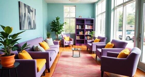
Pale blue and soft purple create a peaceful and sophisticated color combo perfect for your space. Use pale blue as the main wall color to promote tranquility, then add soft purple accents through decor items like pillows, curtains, or artwork for a touch of creativity. Incorporate neutral tones and metallic accents to add elegance, while layered textures deepen the visual interest. Keep the palette balanced to craft a calming environment that inspires relaxation and elegance—learn more about balancing these hues effectively.
Key Takeaways
- Use pale blue for walls or large surfaces to create a calming, spacious backdrop.
- Incorporate soft purple as accent colors through decor items like pillows, art, or curtains.
- Combine metallic silver or platinum accents with the palette for added elegance and sophistication.
- Layer textures such as plush fabrics, ceramics, or matte finishes to deepen visual interest.
- Balance the dominant and accent colors to maintain a peaceful, refined atmosphere in your space.

If you’re looking to create a calming and elegant space, pairing pale blue with soft purple offers a perfect palette. These colors naturally evoke serenity and sophistication, making them ideal choices for bedrooms, living rooms, or even tranquil workspaces. Understanding the color symbolism behind these hues can help you harness their full potential. Pale blue often symbolizes tranquility, trust, and clarity, while soft purple is associated with creativity, luxury, and spirituality. Combining them can foster an environment that feels both peaceful and inspiring, encouraging relaxation and imaginative thinking. When you incorporate these shades into your space, you’re not just choosing aesthetically pleasing colors; you’re also crafting an atmosphere that communicates calmness and refinement.
In terms of color combinations, pale blue and soft purple create a harmonious balance that is easy on the eyes. Their close proximity on the color wheel makes them natural partners, resulting in a cohesive and soothing visual effect. You might consider using pale blue as the dominant color with accents of soft purple to add depth and interest. For example, paint the walls a gentle blue hue, then introduce purple through accessories like throw pillows, artwork, or curtains. Alternatively, you could use soft purple as the primary shade, with pale blue accents to keep the look light and airy. This combination works well because it avoids overwhelming the senses, instead offering a subtle contrast that enhances the overall ambiance.
When selecting furniture and decor, stick to neutral tones like whites, creams, or light grays to allow the pale blue and soft purple to shine without competing for attention. Metallic accents, such as silver or platinum, can add a touch of elegance, further elevating the space’s sophisticated vibe. Layering different textures—like plush fabrics, smooth ceramics, or matte finishes—can also deepen the visual interest without disrupting the calming effect. If you’re aiming for a more vibrant look, consider adding small pops of complementary or analogous colors, but keep the overall palette restrained to maintain its serenity. Incorporating layered textures can enhance the tactile experience and add depth to your design.
Ultimately, the key to successfully using pale blue and soft purple lies in thoughtful pairing and balance. When you understand their symbolism and how they work together as color combinations, you can create a space that’s both peaceful and refined. These hues communicate a gentle sense of luxury and calm, making your environment not just beautiful but also a sanctuary for relaxation and inspiration. Whether you’re designing a cozy retreat or a stylish lounge, this color duo provides a versatile and timeless foundation.
Frequently Asked Questions
How Can I Incorporate Pale Blue and Soft Purple Into My Home Decor?
To incorporate pale blue and soft purple into your home decor, start with a cohesive color palette coordination by painting walls or selecting furniture in these shades. Add decorative accent ideas like throw pillows, rugs, or artwork to bring in pops of color. You can also use soft purple as a calming element and pale blue for freshness, creating a balanced, inviting space that feels both soothing and stylish.
Are These Colors Suitable for Outdoor or Garden Designs?
While pale blue and soft purple might seem delicate, they’re perfect for outdoor or garden designs. These colors create serene garden color schemes that evoke calm and elegance. Pair them with natural elements like greenery and stone for a harmonious look. Plus, they inspire outdoor furniture ideas that feel revitalizing and inviting. Use these shades on cushions, planters, or even garden accents to bring a soft, invigorating vibe to your outdoor space.
What Are the Best Complementary Colors for Pale Blue and Soft Purple?
For a striking color pairing, you should consider warm tones like soft yellows or muted oranges to create contrast options that enhance pale blue and soft purple. Earthy shades like gentle browns or warm grays also work well, providing a subtle contrast. These complementary colors bring balance and harmony to your design, making your outdoor or garden space feel inviting and visually appealing. Experiment with different contrast options to find what suits your style best.
How Do These Colors Affect Mood and Ambiance?
These colors drastically influence your mood and ambiance, creating a calming and serene environment that feels almost otherworldly. Pale blue triggers deep psychological effects, promoting tranquility and focus, while soft purple sparks creativity and relaxation. Together, they craft an ambiance of peaceful elegance, making any space feel like a soothing retreat. You’ll find yourself immersed in a harmonious vibe that enhances well-being and inspires calm, making every moment feel extraordinary.
Can These Shades Be Used Effectively in Fashion or Accessories?
Yes, you can definitely use pale blue and soft purple effectively in fashion and accessories. These shades make stylish statements when paired thoughtfully, like with neutral tones or bold accents. Consider using them for statement pieces or subtle accents in accessories such as scarves, jewelry, or handbags. Their calming yet sophisticated vibe adds elegance, making your outfits stand out while maintaining a balanced, chic look.
Conclusion
Now that you’ve explored the gentle harmony between pale blue and soft purple, imagine how these colors can transform your space into a serene retreat. Their calming presence contrasts beautifully with vibrant accents, creating a perfect balance of tranquility and energy. Embrace this delicate duo to evoke peace in your surroundings, while the subtle contrast keeps things interesting. With these shades, you’ll enjoy a soothing environment that’s both inviting and unexpectedly lively.