To reduce eye strain, choose color palettes with soft, neutral backgrounds like pale beige or light gray paired with dark, contrasting text such as navy or deep green. Avoid bright, neon hues and low-contrast schemes, favoring harmonious combinations like gentle blues and greens or warm taupes with muted oranges. Using these color schemes can enhance clarity and comfort. Keep exploring for more expert tips on creating eye-friendly designs that suit seniors perfectly.
Key Takeaways
- Use soft, neutral background colors like beige, light gray, or pastel shades to reduce glare and promote visual comfort.
- Pair dark, contrasting text such as navy or deep green with light backgrounds for optimal readability.
- Avoid high-contrast schemes like white on black or bright neon colors; opt for muted, harmonious palettes.
- Incorporate analogous color combinations, such as soft blues and greens, to create a soothing visual experience.
- Select vibrant but gentle hues that stand out without overwhelming, reducing eye strain for senior readers.

Choosing the right color palettes can considerably enhance comfort and visibility for seniors. As someone who wants to make environments more accessible, understanding which colors reduce eye strain is essential. When selecting colors, prioritize shades with high contrast, but avoid overly bright or neon hues, which can be harsh on aging eyes. Soft, muted tones combined with bold accents create a balance that helps seniors distinguish objects and text more easily. For example, pairing a gentle background color with darker, contrasting text ensures readability without causing glare or fatigue.
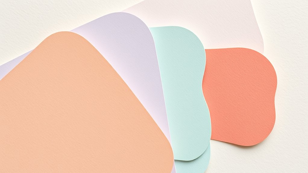
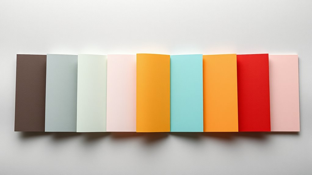
Opt for backgrounds in light, neutral shades like beige, pale gray, or soft pastel tones. These colors minimize glare and provide a calm, soothing backdrop that reduces visual stress. On the other hand, use darker, contrasting colors for text or important elements, such as navy or deep green against a light background. This contrast helps the eyes focus and makes reading or recognizing objects more effortless. Keep in mind that overly stark contrasts, like pure black on bright white, can sometimes cause discomfort, so opt for softer, more comfortable combinations.
Avoid color schemes with low contrast, such as light gray text on a white background, which can be difficult to read and cause unnecessary strain. Similarly, using overly bright colors like fluorescent yellow or intense reds for backgrounds or large sections can be overwhelming. Instead, choose colors that are vibrant enough to stand out but not so intense that they cause discomfort. Incorporating shades from the same color family with subtle differences can also improve visual clarity while reducing fatigue.
Another key consideration is color harmony. Select palettes that are easy on the eyes by sticking to complementary or analogous color schemes. These combinations create harmony and prevent visual confusion. For instance, pairing soft blues with gentle greens or warm taupes with muted oranges offers a pleasing aesthetic that’s easy to process visually. This approach makes it easier for seniors to focus on content without distraction or eye strain. Additionally, understanding color psychology can help in selecting hues that promote calmness and comfort.
Frequently Asked Questions
How Do Lighting Conditions Affect Color Perception for Seniors?
Lighting conditions considerably impact how you perceive colors, especially as you age. Bright, well-lit spaces help you distinguish colors better, reducing eye strain and improving clarity. Avoid harsh or dim lighting, which can distort colors and cause discomfort. Using natural light or soft, diffuse lighting creates an ideal environment. Adjust your lighting to match your needs, ensuring you see colors accurately and comfortably, making reading and everyday tasks easier.
Are There Specific Devices That Enhance Color Readability for Seniors?
Think of devices as your guiding lanterns in the dark. You can choose e-readers with adjustable contrast and brightness, which act like a lighthouse, illuminating text clearly. Tablets with customizable color settings help you adapt hues for better readability, serving as your personal palette. Screen magnifiers and high-contrast monitors further sharpen your view, turning technology into a trusted companion that brightens your reading experience and keeps eye strain at bay.
Can Color Palettes Be Customized for Individual Vision Needs?
Yes, you can customize color palettes to suit your individual vision needs. Many devices and software offer adjustable settings, allowing you to select high-contrast themes, tweak color schemes, or enable filters that reduce glare. By personalizing these options, you make reading easier and reduce eye strain. Take advantage of accessibility features on your device or seek specialized software to create a comfortable visual experience tailored just for you.
How Often Should Seniors Update Their Color Preferences?
You should review and update your color preferences whenever your vision changes or if you notice discomfort while reading or viewing screens. Regular check-ins with your eye care professional can help determine if your needs have shifted. Typically, it’s good to reassess every year or two, especially if you experience new eye issues or your eyesight deteriorates. Staying proactive guarantees your color choices remain comfortable and effective.
Do Cultural Differences Influence Preferred Color Schemes for Seniors?
Yes, cultural differences influence preferred color schemes for seniors. You might find that colors hold specific meanings or evoke certain emotions based on cultural backgrounds. For example, some cultures favor vibrant reds or golds, while others prefer softer pastels. When designing for seniors, consider their cultural context to select colors that resonate positively, making the environment more comfortable and engaging for them.
Conclusion
Choosing the right color palette can substantially reduce eye strain and improve readability for seniors. With over 80% of adults over 50 experiencing some form of vision change, selecting high-contrast, easy-to-read colors becomes essential. By applying these thoughtfully designed palettes, you can make reading more comfortable and enjoyable. Remember, small adjustments in color choices can make a big difference in preserving your eye health and enhancing your daily activities.


