
To improve stair safety, use high-contrast colors like yellow or orange to paint the edges and nosing of each step. Differentiating risers and treads with contrasting shades helps your eyes recognize step boundaries easily. Avoid dull or uniform colors that can blend together. Adding bold outlines or textured finishes enhances visibility and tactile feedback. Combining these color strategies with good lighting creates a safer environment. Keep these tips in mind, and you’ll discover even more effective ways to prevent falls.
Key Takeaways
- Use high-contrast colors, like dark risers with light treads, to clearly define each step and improve visibility.
- Paint the nosing or front edge of stairs in vivid, contrasting colors to highlight step boundaries.
- Incorporate textured or matte finishes on nosing for tactile feedback and added safety.
- Ensure consistent, bold color schemes that stand out in poor lighting or for visually impaired users.
- Regularly maintain and repaint worn edges to preserve visibility and prevent accidents over time.
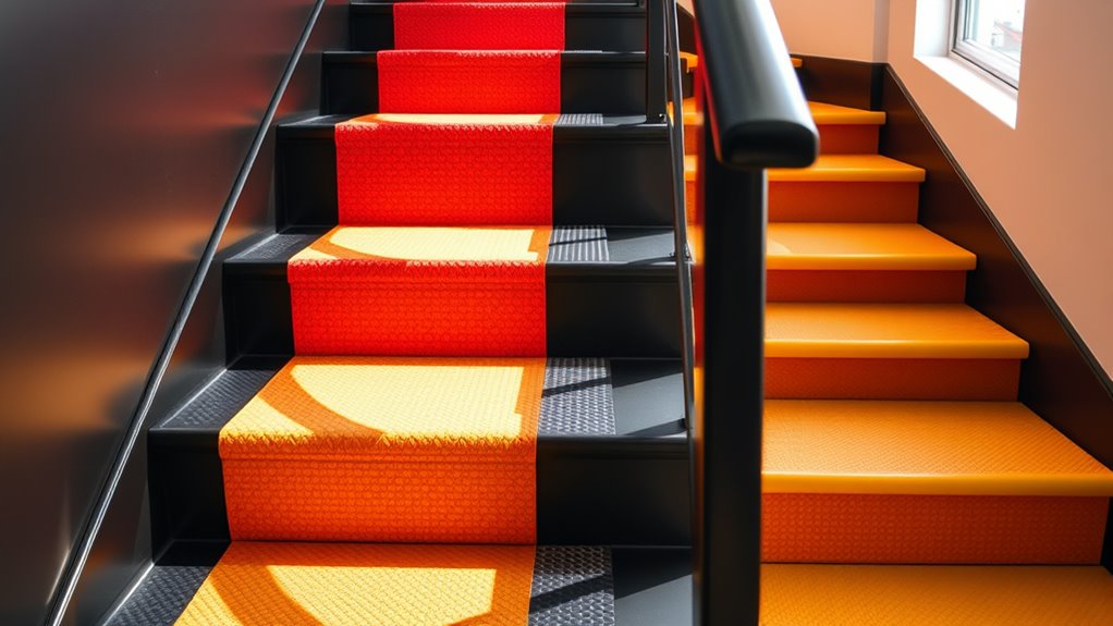
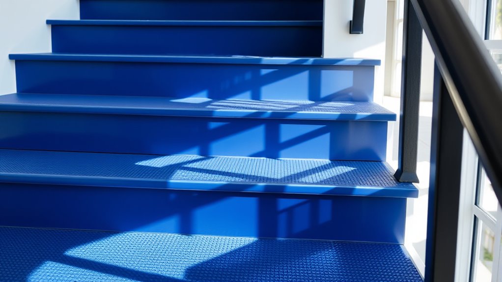
Stairs are a common source of falls and injuries, but choosing the right colors can substantially improve safety. When you focus on stair color strategies, you help prevent accidents and create a safer environment for everyone. Bright, contrasting colors can make each step more visible, especially in areas with poor lighting or for individuals with visual impairments. For example, painting the edge of each step in a vivid color like yellow or orange dramatically increases visibility. This contrast helps you distinguish the edge from the tread, reducing the risk of missteps. You might also consider using a different color or tone for the nosing—the front edge of each step—to further enhance contrast. The goal is to make each step stand out clearly, so your eyes can quickly and easily recognize where one step ends and the next begins. Incorporating color contrast principles into your stair design ensures maximum safety and visibility. You should avoid using uniform or dull colors that blend together, as they make it more difficult to see individual steps. Instead, opt for high-contrast schemes: dark risers with light treads or vice versa. This visual separation guides your eye naturally along the staircase, minimizing confusion. If your stairs are inside, you can also incorporate textured or matte finishes on the nosing or edges, which provide tactile feedback and help you feel where each step begins and ends. For outdoor stairs exposed to weather, choose colors that resist fading and provide consistent contrast over time. Regular maintenance, like repainting worn edges, guarantees your safety measures remain effective. Lighting plays a vital role in stair safety, but colors are equally important. Even the brightest lighting can’t compensate for poor contrast, so ensure your stairways are painted in a way that maximizes visibility in any lighting condition. If you have elderly family members or visitors with visual impairments, consider using color schemes recommended by safety experts, such as contrasting shades for risers and treads or bold outlines around each step. These visual cues act as subconscious signals, guiding users safely up and down the stairs. Ultimately, the right color choices aren’t just about aesthetics—they’re essential safety tools. By selecting high-contrast, clearly differentiated colors for your stairs, you create a visual environment that supports safe navigation. It’s an easy, effective way to reduce falls and injuries, and it’s something you’ll wish you’d known earlier to protect yourself and your loved ones.
Frequently Asked Questions
How Do Different Lighting Conditions Affect Stair Visibility?
Different lighting conditions can substantially impact your stair visibility. In bright light, you see stairs clearly, reducing trip hazards. Dim or uneven lighting, however, creates shadows and obscures steps, making it harder to judge depth and position. You should guarantee consistent, adequate lighting, especially in darker areas. Using contrasting colors on stair treads and edges also helps your eyes distinguish each step, regardless of lighting conditions, boosting safety.
Are Certain Colors More Effective for Elderly Safety?
Bright, high-contrast colors like yellow or white are most effective for elderly safety on stairs. They create a clear distinction between steps and the surrounding area, reducing the risk of trips and falls. You might think darker colors hide edges, but they can blend into shadows, making steps hard to see. Using these vibrant shades guarantees better visibility and confidence, especially in low-light or challenging conditions.
How Often Should Stair Color Be Updated or Maintained?
You should inspect your stair colors regularly, ideally every three to six months, to guarantee they remain clear and effective. If you notice fading, peeling, or loss of contrast, update or repaint the colors promptly. Proper maintenance helps prevent accidents by keeping the visual cues sharp. Regular checks and timely updates are essential, especially in high-traffic areas or environments with changing lighting conditions, to maintain supreme safety.
Can Color Contrast Help Prevent Specific Types of Falls?
Absolutely, color contrast can prevent falls—who knew that a splash of bright yellow or contrasting black and white could save your life? You should use high-contrast colors on stair edges and treads; it’s like giving your eyes a clear roadmap. When your stairs stand out vividly against the surroundings, you’re less likely to trip or misstep, turning a potential disaster into a safe, colorful walk.
What Are the Best Practices for Choosing Stair Colors for Outdoor Environments?
You should choose high-contrast, weather-resistant colors like bright yellow or white for outdoor stairs, ensuring they stand out against the environment. Use bold, matte finishes to prevent slipping and consider adding reflective strips for visibility in low light. Avoid dark or similar tones to surrounding surfaces. Regularly inspect and touch up paint to maintain visibility and safety, especially after harsh weather conditions, so you reduce trip hazards effectively.
Conclusion
By choosing the right stair colors, you can transform your space into a safer, more inviting place—like a lighthouse guiding you safely home. Remember, contrast is key, so don’t shy away from bold hues that make each step stand out. When you prioritize visibility and clarity, you create an environment where accidents are less likely. So, take these strategies to heart and make your stairs as safe as they are stylish. Your peace of mind is worth it!