
To create two distinct zones in a single room, use a two-tone color approach. Paint the upper section in a light, neutral shade for an airy feel, and use a darker hue on the lower part to anchor the space. Add molding or a painted line to clearly divide the areas. This technique guides the eye and adds personality without walls. Keep exploring to discover how subtle details can elevate this trick even more.
Key Takeaways
- Use contrasting colors to visually divide a room into two distinct zones, enhancing functionality and style.
- Choose a lighter hue for the upper area and a darker shade for the lower to create depth and define spaces.
- Incorporate molding, painted lines, or chair rails for a polished, clear boundary between zones.
- Adjust the height of the color division based on ceiling height and furniture placement for optimal balance.
- Add lighting and greenery to highlight the zones, making the space more dynamic and personalized.
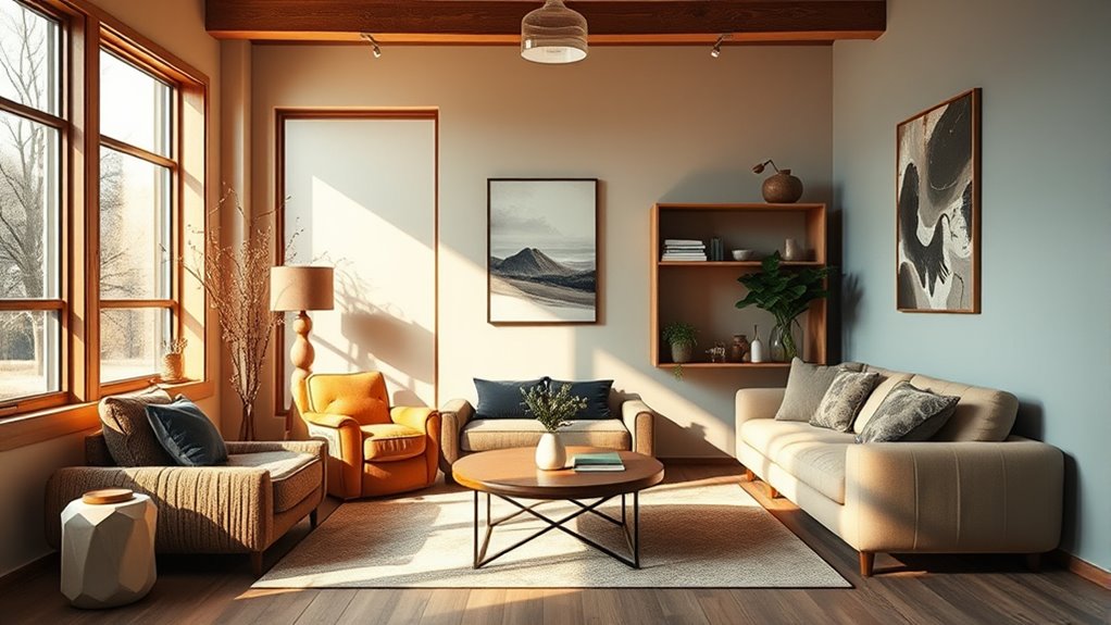
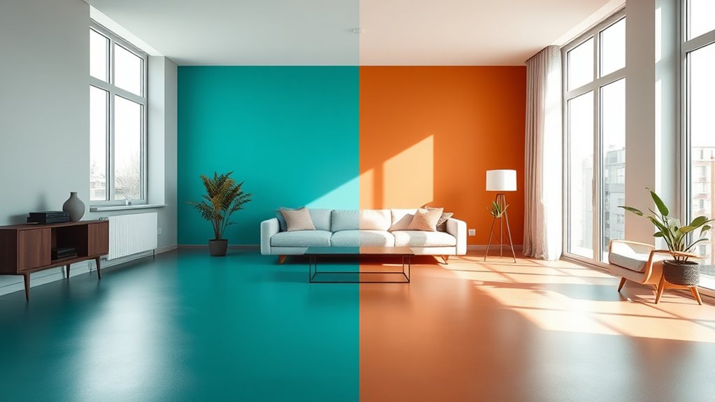
If you’re looking to add visual interest and depth to a single room, the one-room, two-zone color trick is a game-changer. This technique allows you to define different areas within the same space, making it feel larger, more dynamic, and tailored to your needs. It’s especially useful in shared spaces like living rooms, open-concept kitchens, or bedrooms where distinct zones can enhance functionality and style without the need for walls or partitions. The core idea is simple: paint or decorate the upper and lower portions of the walls in contrasting colors or shades, creating a visual divide that guides the eye and adds personality.
Start by choosing two complementary colors that suit your overall design aesthetic. Consider one lighter, neutral tone for the upper zone, which helps keep the space feeling airy and expansive. For the lower zone, opt for a richer or darker hue that anchors the room and adds depth. Think of a soft beige for the top paired with a deep navy or charcoal below. This contrast immediately establishes a visual boundary, even though the space remains open. To make the *shift* seamless, you can add a chair rail, molding, or even a simple painted line to delineate the two zones clearly. These details not only reinforce the division but also give a polished, intentional look.
Choose two complementary colors—light for the top, dark for the bottom—to create a stylish, defined space.
When applying this technique, pay attention to scale and proportion. If your ceiling is high, you might want to extend the color block higher up the wall to make the ceiling feel closer, creating a cozy effect. Conversely, in rooms with lower ceilings, keep the color separation closer to the middle to avoid making the space feel cramped. You can also modify the height of the color divide based on furniture placement—such as painting the lower zone darker and reserving the lighter color for the upper part, which visually lifts the ceiling and opens up the room. Additionally, incorporating specialized planters can help define different zones through greenery, adding natural texture and further emphasizing the separation.
Lighting plays a *vital* role in this scheme. Use natural light to highlight the contrast, and supplement with layered lighting to emphasize the different zones. Wall sconces, picture lights, or accent lamps can draw attention to the various sections, making the color division even more striking. This approach also offers flexibility: you can change the colors down the line if you want a fresh look or switch up the zones for different functions or moods. The beauty of the one-room, two-zone color trick is that it transforms a single space into a multi-dimensional environment, adding personality and sophistication without the need for major renovations.
Frequently Asked Questions
Can This Color Trick Be Used in Outdoor Shared Spaces?
Yes, you can use this color trick in outdoor shared spaces. You’ll want to choose durable, weather-resistant paints that can withstand sun, rain, and other elements. Apply the colors carefully, ensuring they’re properly sealed to prevent fading or peeling. This approach helps define different zones clearly and adds visual interest, making your outdoor area more functional and inviting. Just remember to select high-quality outdoor paints for long-lasting results.
How Does Natural Light Affect the Two-Zone Color Technique?
Think of natural light as your home’s secret artist—it changes throughout the day, influencing your color zones. Bright sunlight can make colors appear more vibrant, while shadows soften them. You’ll want to test your chosen hues at different times to see how they shift. Embrace the dance of light and color, adjusting as needed, to create a space that feels lively and balanced no matter the time of day.
Is This Method Suitable for High-Traffic Areas?
Yes, this method works well in high-traffic areas because it visually defines different zones, helping to organize the space and reduce clutter. You can choose durable, easy-to-clean paints for each zone, ensuring they withstand frequent use. The contrasting colors also guide movement and create a lively atmosphere. Just make sure to select colors that complement each other and suit the overall style of your space.
What Are the Best Color Combinations for Small Rooms?
For small rooms, light and neutral colors like soft blues, warm beiges, or pale grays work best, making the space feel larger and more open. You can add pops of brighter colors, such as coral or teal, for accents to create visual interest without overwhelming the room. Stick to a cohesive palette and avoid dark or overly busy patterns, which can make a small space feel cramped.
How Long Does It Take to See the Full Effect?
You’ll start noticing the full effect of the color trick within a few days, but it can take up to two weeks for the space to feel completely transformed. Your eyes need time to adjust to the new hues and for the changes to influence the room’s overall vibe. Be patient, and enjoy observing how the different zones create a dynamic, balanced environment that feels more spacious and inviting over time.
Conclusion
So, you thought dividing a room with just two colors was a game-changer? Turns out, it’s the simplest trick that tricks the eye—and your brain. You get the illusion of separate spaces without any walls or fuss. Ironically, the real magic isn’t in expensive renovations but in clever color choices. So, go ahead, embrace the simplicity—after all, who knew that a little paint could do so much? Your space just got a whole lot smarter.