

To create soothing color palettes for dementia care, focus on gentle hues like soft blues, greens, and warm neutrals that promote calm and safety. Pair these colors with soft, warm lighting to enhance their calming effect and avoid harsh glare. Incorporate tactile elements like textured finishes to support sensory integration. Balancing light and color helps minimize confusion and overstimulation. Keep exploring to discover how combining colors, lighting, and textures creates a truly comforting environment.
Key Takeaways
- Choose soft, muted colors like pastels and earth tones to promote calm and reduce overstimulation.
- Incorporate warm lighting to enhance the soothing effect of gentle color palettes.
- Use calming shades of blue, green, or beige to create a sense of security and relaxation.
- Integrate tactile elements with textured finishes and soft furnishings to reinforce visual calmness.
- Ensure visual harmony through balanced contrast and appropriate lighting to support sensory comfort and navigation.
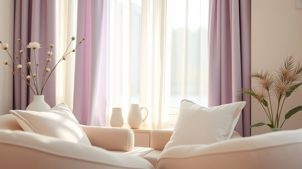
Designing calming color palettes for dementia care is essential for creating environments that promote comfort and reduce agitation. When you choose colors thoughtfully, you help establish a space where individuals feel safe and relaxed. But color isn’t the only element at play—lighting design is equally important. Proper lighting enhances the effects of your color choices, ensuring they appear warm and inviting rather than harsh or sterile. Soft, natural light or diffused artificial lighting can complement gentle color schemes, making spaces feel cozy and familiar. You should aim for lighting that minimizes glare and shadows, which can cause confusion or discomfort. This not only improves visual clarity but also supports sensory integration, helping residents process their surroundings more easily. Incorporating the right balance of lighting and color can significantly improve the overall sensory environment for those with dementia. Sensory integration is a key aspect of dementia care, and it overlaps with color and lighting choices. When your environment engages multiple senses harmoniously, it can soothe agitation and foster a sense of well-being. For example, combining muted pastel tones with warm lighting creates a gentle visual experience that doesn’t overstimulate. Think about how the interplay of light and color can influence mood—cooler hues like blues and greens tend to be calming, but if they’re paired with overly bright lighting, they might feel cold rather than tranquil. Conversely, warmer tones like soft yellows or beiges, when illuminated with warm lighting, evoke a cozy atmosphere that feels safe and familiar. You should also consider how sensory integration extends beyond sight. Incorporating tactile elements, such as textured wall finishes or soft furnishings, can reinforce the calming effect of your color palette. When residents touch surfaces that feel soothing and look visually harmonious, their sensory experience becomes more cohesive, reducing confusion and agitation. By integrating lighting design carefully with your color choices, you create a balanced environment that supports both visual and tactile senses. This approach helps residents navigate their space with confidence, reducing frustration and enhancing their overall quality of life.
Frequently Asked Questions
How Do Color Preferences Vary Among Individuals With Dementia?
You’ll find that personal color preferences vary widely among individuals with dementia, influenced by their unique experiences and memories. Cognitive color recognition may decline, so stick to familiar, calming colors to ease confusion. Pay attention to their reactions—some might prefer soft pastels, while others respond better to bold, warm tones. Tailoring color choices to their personal likes can help create a more comforting environment and support their well-being.
Can Color Choices Influence Mood and Behavior in Dementia Patients?
Yes, your color choices can influence mood and behavior in dementia patients. By using calming colors, you promote relaxation and reduce agitation through the psychological impact of color therapy. Soft, muted tones help create a soothing environment, which can ease anxiety and improve overall well-being. Thoughtful color selection becomes a powerful tool in dementia care, helping you foster a peaceful atmosphere that supports your patient’s emotional and behavioral stability.
What Are Common Mistakes to Avoid When Selecting Soothing Colors?
Avoid common mistakes like choosing overly bright or harsh colors that can cause overstimulation hazards, increasing agitation. Steer clear of inappropriate color combinations that clash or create visual confusion, making it harder for dementia patients to navigate their environment. Instead, select soft, muted tones and harmonious palettes to promote calmness. Always consider how colors interact and test them in the space to guarantee they foster a soothing, comfortable atmosphere.
How Do Environmental Lighting Conditions Affect Color Perception?
Lighting conditions act like a painter’s brush, shaping how colors appear and feel. They directly influence perceptual differences, making hues seem warmer, cooler, or duller. Bright, natural light reveals true colors, while dim or artificial lighting can distort them, causing confusion or discomfort. You need to take into account these variations carefully, as they can dramatically change the environment’s calming effect, ensuring your space remains soothing regardless of the lighting’s mood.
Are There Cultural Considerations in Choosing Calming Color Palettes?
Yes, cultural considerations matter when choosing calming color palettes. You should consider cultural symbolism and regional color meanings, as colors can evoke different emotions and associations. For example, white symbolizes purity in some cultures but mourning in others. By understanding these nuances, you guarantee the environment feels familiar and comforting, helping to reduce confusion and agitation for individuals from diverse backgrounds.
Conclusion
By choosing calming color palettes, you can substantially improve the comfort and well-being of those with dementia. Studies show that soothing environments can reduce agitation by up to 30%, making daily life more peaceful. When you incorporate gentle shades like soft blues and warm neutrals, you create a welcoming space that promotes calmness and safety. Your thoughtful choices can truly make a difference, helping your loved ones feel more at ease and cared for every day.