
When choosing calming colors for senior homes, focus on soft, muted tones like gentle blues, warm neutrals, and subtle greens to promote relaxation and reduce stress. Opt for color schemes that flow harmoniously, such as analogous blues and greens, to create a peaceful environment. Avoid bright or contrasting shades that can cause visual noise. Balancing these colors thoughtfully enhances residents’ emotional well-being, and exploring further can help you craft an ideal, soothing space for everyone.
Key Takeaways
- Opt for soft, muted hues like gentle blues, greens, and warm neutrals to promote relaxation and reduce stress.
- Use harmonious color schemes, such as analogous palettes, to create a cohesive and calming environment.
- Prioritize low-saturation and light-brightness tones to foster a soothing and tranquil atmosphere.
- Limit bold or contrasting colors to prevent visual noise and maintain a peaceful space.
- Incorporate color coordination techniques to ensure seamless transitions and enhance residents’ emotional well-being.
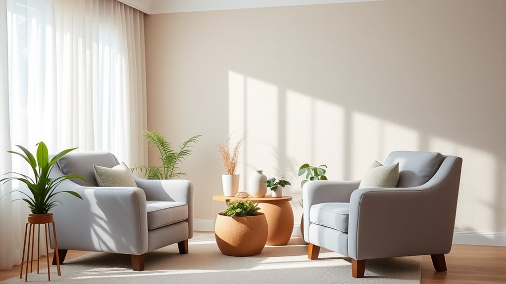
Colors have a powerful impact on your mood and sense of calm, making the right choices essential for creating a soothing environment. When selecting colors for senior homes, understanding soothing color psychology is fundamental. Certain hues are known to promote relaxation, reduce stress, and foster a peaceful atmosphere. Soft blues, gentle greens, and warm neutrals are often top contenders because they evoke feelings of tranquility and stability. These colors help create a space where residents feel safe and comfortable, which is indispensable in environments focused on well-being.
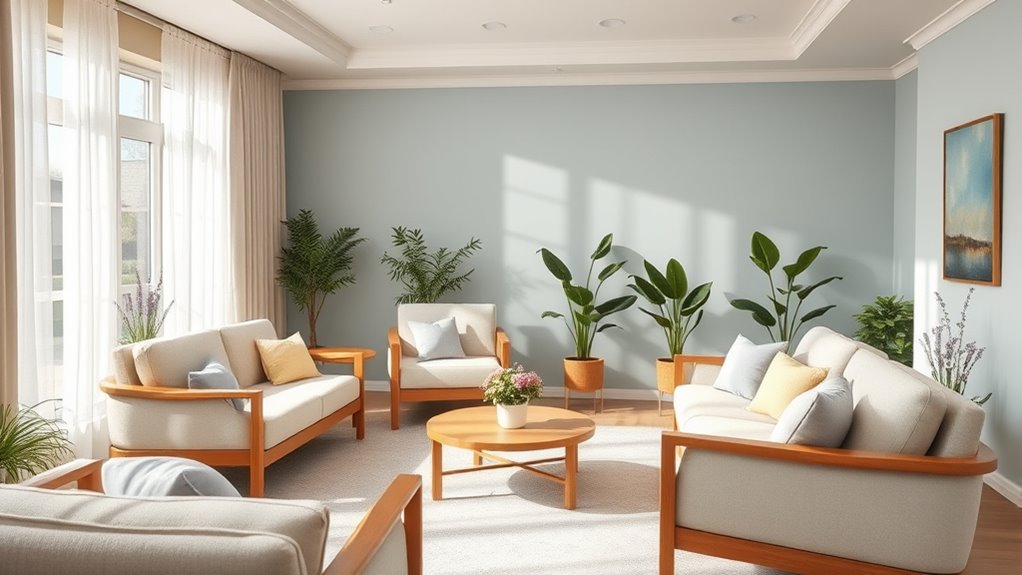
To effectively incorporate soothing color psychology into your design, you should also consider color coordination techniques. These methods help guarantee a harmonious flow throughout the space, avoiding jarring transitions that could disrupt the calming effect. For example, pairing a soft blue with a muted beige creates a subtle contrast that maintains serenity. Using analogous color schemes—colors next to each other on the color wheel—can further enhance the sense of cohesion and calm. For instance, combining various shades of green and blue can produce a unified, soothing palette that feels natural and inviting.
When choosing paint and décor, keep in mind that the saturation and brightness of colors matter just as much as the hue itself. Light, muted tones tend to be more relaxing than vivid or overly bright shades. Incorporate these tones into walls, furniture, and accessories to craft a cohesive, calming environment. You might paint walls in a soft sage green, then add décor accents in lighter shades of blue or cream. This creates a layered, harmonious look that gently guides the eye and fosters tranquility.
Remember, balance is key. Too many bold or contrasting colors can create visual noise, undermining the purpose of a calming space. Instead, opt for a restrained palette that emphasizes softness and simplicity. Use color coordination techniques to select complementary shades and distribute them thoughtfully across the room. For example, if you choose a soothing blue for the walls, introduce accent pillows, curtains, or artwork in shades of soft gray or blush to add depth without overwhelming the senses. Additionally, understanding color saturation helps in selecting tones that promote relaxation without feeling dull or lifeless. Emphasizing the importance of color psychology, selecting hues with intentional meaning can further enhance the emotional well-being of residents.
Ultimately, choosing calming colors for senior homes isn’t just about aesthetics—it’s about creating an environment that nurtures peace and comfort. By understanding soothing color psychology and applying effective color coordination techniques, you can design spaces that promote relaxation and enhance residents’ quality of life.
Frequently Asked Questions
What Color Combinations Are Best for Reducing Anxiety?
When selecting colors to reduce anxiety, you should focus on soothing color palettes and tranquil color combinations. Opt for soft blues, gentle greens, and warm neutrals that create a calming environment. These colors promote relaxation and help ease stress. You can combine these hues with subtle accents to maintain a peaceful atmosphere. By choosing the right tranquil color combinations, you’ll help create a space that feels safe and welcoming, reducing anxiety effectively.
How Do Lighting Choices Affect Calming Color Schemes?
Lighting choices play a crucial role in enhancing calming color schemes. You should opt for lighting temperature that mimics natural daylight, which helps create a soothing environment. Incorporate natural light integration whenever possible, as it reduces stress and boosts well-being. By balancing warm and cool lighting, you accentuate calming colors, making spaces feel more inviting and tranquil for seniors. Proper lighting ensures the colors’ calming effects are fully realized.
Are There Specific Paint Finishes Recommended for Senior Homes?
Your paint choices can transform a space into a sanctuary, and selecting the right finish is key. For senior homes, go for high-quality, durable finishes that withstand wear and tear, yet are easy to clean. Eco-friendly finishes are also essential, ensuring a healthier environment. Satin or eggshell finishes are recommended—they balance durability with a soft, calming appearance, making the space welcoming and safe for residents.
How Often Should Paint or Décor Be Refreshed for Optimal Calmness?
You should refresh paint and décor every 2-5 years to maintain a calming environment. Regular updates help guarantee paint durability and keep décor looking fresh, reducing visual clutter that can cause stress. Keep an eye on wear and tear, and replace or touch up items as needed. Consistent maintenance creates a soothing atmosphere for seniors, promoting comfort and tranquility while minimizing the need for extensive décor maintenance.
Can Personalized Color Preferences Impact Residents’ Well-Being?
Did you know that personalization benefits can considerably boost residents’ well-being? When you consider their individual color preferences, you create a more comforting environment. Cultural color influences also play a role, helping residents feel more at home. By incorporating personalized colors, you enhance emotional comfort, reduce stress, and promote a sense of belonging. Your attention to these preferences shows respect and care, ultimately improving their overall quality of life.
Conclusion
Research shows that calming colors can reduce stress and improve well-being in senior homes by up to 30%. By choosing soothing shades like soft blues and gentle greens, you create a peaceful environment that supports relaxation and comfort. Remember, your color choices can notably impact residents’ mood and quality of life. So, take the time to select palettes that promote calm and tranquility—your care and thoughtful design can make a real difference.