
To create a soothing color palette in memory care rooms, focus on soft, muted tones like gentle blues, warm beiges, and soft greens. These colors promote relaxation, reduce anxiety, and help residents feel familiar and safe. Pair light blue with cream accents or natural shades like taupe to foster calmness and comfort. Proper lighting and consistent color schemes enhance these effects, making the space more welcoming. Discover more tips to design a tranquil environment for your residents.
Key Takeaways
- Use soft, muted tones like gentle blues, warm beiges, and soft greens to promote relaxation.
- Pair light blue with cream accents for a calming and harmonious environment.
- Incorporate natural shades such as taupe and soft browns to add coziness without overstimulation.
- Avoid harsh or overly bright colors, favoring matte or eggshell finishes to reduce glare.
- Ensure consistent, harmonious color schemes complemented by warm lighting to enhance tranquility and familiarity.

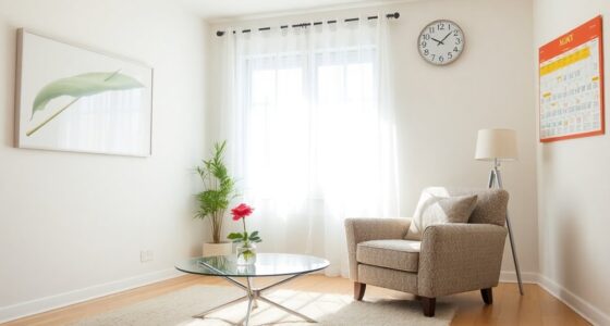
Choosing the right color palette for memory care rooms can considerably impact residents’ comfort and well-being. When selecting colors, you want to focus on creating an environment that feels safe, familiar, and soothing. Beneficial color combinations often include soft, muted tones that help reduce anxiety and agitation. These colors have calming visual effects, which can make a substantial difference for residents who may feel overwhelmed by their surroundings. By carefully choosing shades like gentle blues, warm beiges, or soft greens, you help establish a peaceful atmosphere that promotes relaxation and stability.
Choosing soft, muted tones creates a soothing, safe environment that promotes relaxation and well-being.
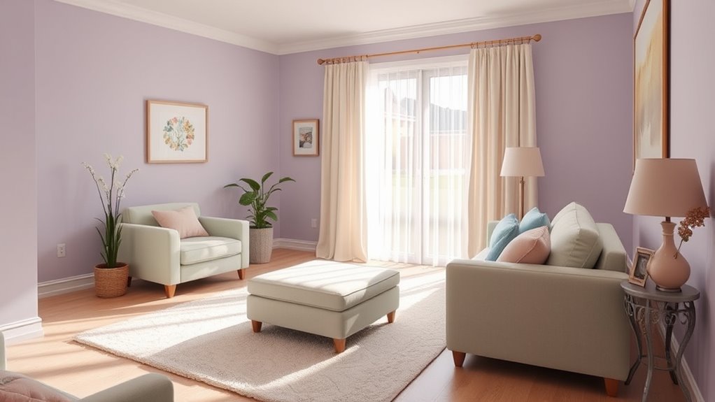
Calming visual effects are essential in memory care settings because they help residents stay centered and reduce stress. Bright or highly contrasting colors can sometimes be confusing or overstimulating, so it’s best to avoid overly vibrant or jarring hues. Instead, opt for harmonious combinations that are easy on the eyes. For example, pairing a light blue with cream accents creates a tranquil environment that feels inviting and safe. These beneficial color combinations work because they mimic natural, familiar surroundings, which can trigger positive memories and emotional comfort.
You should also consider the psychological impact of colors. Blues and greens are known for their soothing qualities, often associated with nature and serenity. Warm neutrals like taupe or soft browns can add a cozy feel without overwhelming the senses. These shades not only foster calm but also help residents maintain orientation within the space. When the color palette is consistent and thoughtfully chosen, it minimizes confusion and supports residents’ sense of familiarity. This consistency is vital, especially when residents experience cognitive decline, as it helps create a predictable and secure environment.
In addition, lighting plays a role in enhancing calming effects. Natural light or warm artificial lighting can amplify the soothing qualities of your color choices. Keep walls painted in matte or eggshell finishes to avoid glare, and ensure the space is well-lit without being harsh. This combination of appropriate colors and lighting conditions helps residents feel more relaxed, promoting better mood and behavior.
Furthermore, understanding the impact of color temperature can guide you in selecting the most calming shades for the environment. Ultimately, the goal is to craft a space where residents feel comfortable, safe, and at ease. By selecting beneficial color combinations that produce calming visual effects, you foster an environment conducive to peace of mind. Thoughtful color choices and mindful design can greatly improve residents’ quality of life, making your memory care room not just functional but genuinely comforting.
Frequently Asked Questions
How Do Color Choices Affect Residents’ Emotions Long-Term?
Color choices directly influence residents’ emotions long-term by promoting mood enhancement and visual comfort. You’ll find that calming colors like soft blues and gentle greens help reduce anxiety and create a peaceful environment. Over time, these colors foster a sense of stability and safety, which can improve overall well-being. By thoughtfully selecting colors, you support residents’ emotional health, making their daily experiences more positive and less stressful.
Are There Cultural Considerations in Color Preferences?
You should definitely consider cultural symbolism and regional preferences when choosing colors, as they can dramatically influence residents’ comfort and recognition—sometimes more than you’d expect. Different cultures assign unique meanings to colors, which can evoke strong emotions or memories. Ignoring these nuances risks creating an environment that feels unfamiliar or unsettling. To foster true well-being, tailor your color choices to reflect residents’ cultural backgrounds and regional preferences, making your space genuinely welcoming.
Can Color Schemes Help With Specific Cognitive Conditions?
Color schemes can indeed aid with specific cognitive conditions through color therapy and sensory stimulation. You can choose calming colors like soft blues and greens to reduce agitation, or brighter hues to stimulate alertness. By thoughtfully integrating these colors into memory care rooms, you help create a supportive environment that promotes relaxation or engagement, tailored to individual needs. This approach enhances overall well-being and can improve quality of life for residents.
How to Balance Aesthetics With Safety in Color Selection?
Imagine a room where colors dance in perfect harmony, like a symphony of safety and beauty. You should prioritize color psychology to choose calming hues that soothe, while ensuring high contrast for safety, avoiding jarring shades. Visual harmony prevents overstimulation, helping residents feel secure. By balancing gentle, intentional colors with clear visual cues, you create an environment that’s both aesthetically pleasing and safe, supporting well-being every step of the way.
What Are the Cost Implications of Implementing Soothing Palettes?
Implementing soothing palettes can be budget-friendly if you explore various supplier options and prioritize cost-effective materials. While some colors and finishes may have higher upfront costs, you can balance your budget constraints by selecting affordable paints, wallpapers, and accessories. Planning ahead and comparing prices helps you stay within budget without sacrificing the calming effect. Overall, thoughtful choices and supplier research make it possible to create a soothing environment without overspending.
Conclusion
Just as Monet’s gentle strokes evoke calm in a bustling world, choosing soothing color palettes transforms memory care rooms into havens of peace. Your thoughtful selections create spaces where residents feel safe and comforted, much like a serene lake reflects a tranquil sky. Remember, the right colors don’t just decorate—they nurture. By embracing this mindful approach, you craft environments where serenity and support flourish, turning everyday spaces into gentle retreats reminiscent of a calming masterpiece.