
Adapting your home for low vision involves using high-contrast colors on walls, furniture, and fixtures to make objects stand out clearly. Adding tactile markers like textured labels, raised dots, or ridges on switches, handles, and appliances helps you identify items easily through touch. Combining visual and tactile cues creates a safer environment and boosts your independence. Keep exploring simple ideas to enhance your space even further—there’s more you can do to make your home as accessible as possible.
Key Takeaways
- Use contrasting colors on walls, furniture, and fixtures to improve object visibility and spatial orientation.
- Incorporate textured labels or raised dots on appliances, switches, and controls for tactile identification.
- Install tactile markings on key areas like stairs, bathroom fixtures, and kitchen surfaces to enhance safety.
- Combine visual contrast with tactile cues for seamless navigation and better object recognition.
- Focus on simple modifications to increase safety, independence, and overall quality of life for low-vision individuals.
Living with low vision can make everyday tasks more challenging, but making simple adaptations to your home can greatly improve safety and independence. One effective way to do this is by enhancing contrast and adding tactile cues throughout your living space. These adjustments help your eyes distinguish objects and navigate more confidently, reducing the risk of accidents and increasing your sense of control.
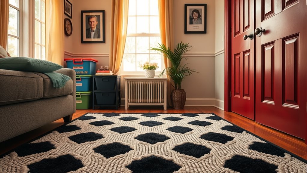
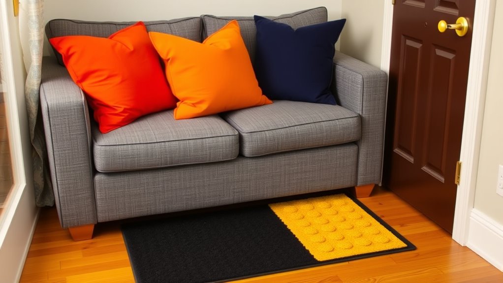
Color differentiation is a key strategy. By choosing contrasting colors for walls, furniture, and everyday items, you make it easier to identify and locate things quickly. For example, painting door frames a darker shade than the walls creates a clear visual boundary, helping you find doorways effortlessly. Similarly, using contrasting colors on kitchen countertops and cabinets can help you recognize where one ends and the other begins, making meal prep safer and more efficient. Bright, bold hues contrasted with neutral backgrounds serve as visual anchors, guiding your eyes to important features and reducing confusion. When selecting decorative elements or organizing your space, keep in mind that high contrast makes a significant difference in visibility.
Use contrasting colors for walls and furniture to enhance visibility and safety throughout your home.
Tactile markings serve as an additional layer of guidance. You can add textured labels or indicators to familiar objects, such as appliances, control panels, or storage containers. For example, placing raised dots or ridges on the edges of remote controls or on the handles of utensils allows you to identify them by touch, even if your vision is blurry or obstructed. Installing tactile markings on light switches and thermostats helps you operate them without having to see small labels or buttons clearly. These tactile cues act as reliable reference points, allowing you to navigate your home more independently. They’re especially helpful in areas where visual cues might be insufficient, such as in poorly lit rooms or when lighting conditions change.
Combining color differentiation with tactile markings creates a holistic system that caters to your visual and tactile senses. This dual approach ensures that you can identify objects through sight and touch, providing a more seamless and confident experience in your daily life. Keep safety in mind by consistently applying high-contrast colors and tactile cues to critical areas, like stairs, bathroom fixtures, and kitchen zones. These small but intentional modifications empower you to manage your environment more effectively, helping you maintain your independence and enjoy your home with greater comfort. Remember, simplifying visual and tactile cues doesn’t require major renovations—small changes can make a big difference in how you interact with your surroundings every day.
Frequently Asked Questions
How Can I Identify the Most Effective High-Contrast Colors for My Home?
To identify the most effective high-contrast colors for your home, start by testing different color combinations that create strong visual markers. Focus on color contrast, such as pairing dark tones with light ones, to make objects stand out clearly. You can also observe which colors catch your eye most easily or ask a low-vision specialist for personalized recommendations. Consistent use of high-contrast colors helps you navigate your space confidently.
What Are the Best Tactile Aids for Navigating Stairs Safely?
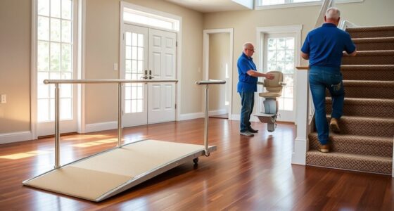
To navigate stairs safely, you should use tactile aids like tactile paving and stair edge markers. Tactile paving provides textured surfaces that alert you when you’re near stairs, while stair edge markers highlight the edge of each step, reducing the risk of tripping or missing a step. These aids give you tactile feedback, making stairways more accessible and safer, especially if your vision loss makes it hard to see step edges clearly.
How Do I Maintain or Replace Tactile and High-Contrast Aids Over Time?
Ever wonder if your tactile and high-contrast aids stay effective over time? You should follow regular cleaning routines to keep them visible and tactile features intact. Check for wear and tear periodically and follow a replacement schedule based on usage and condition. Don’t wait until they’re no longer helpful—your safety depends on clear, reliable aids that you uphold proactively. Are you ready to ensure your home remains safe and accessible?
Are There Specific Brands or Products Recommended for Low Vision Adaptations?
You’re wondering if there are specific brands or products recommended for low vision adaptations. To find the best options, check out recommendation guides and product reviews from trusted sources. These resources highlight top brands known for quality, durability, and effectiveness. Reading reviews helps you compare features and choose aids that suit your needs, ensuring you get reliable, tested products designed to improve your daily life with low vision.
How Can I Involve Family Members in Home Modifications for Low Vision?
Imagine turning home modification planning into a team effort. You can involve family members by sharing your needs and listening to their ideas. Encourage open conversations about safety and accessibility, making them feel valued. Their support can make the process smoother and more enjoyable. Together, you’ll create a space that’s safer and more comfortable, fostering stronger bonds while ensuring your low vision needs are thoughtfully integrated into your home.
Conclusion
By incorporating high-contrast colors and tactile aids, you enhance safety, improve independence, and boost confidence in your home. By choosing bright, bold contrasts, you make navigation easier. By adding textured surfaces, you create cues that guide your steps. By blending these adaptations, you create a space that’s safer, more accessible, and tailored to your needs. Embrace these changes, empower yourself, and turn your home into a place of comfort, clarity, and confidence.