Research indicates that calming colors like blue and green can help reduce agitation and promote relaxation for those with dementia. Soft, muted tones create a soothing environment, while avoiding overly bright or complex patterns prevents confusion. Using these gentle hues, combined with good lighting, fosters a sense of safety and calmness. If you want to learn how to incorporate these colors effectively, there’s more helpful guidance available to support your efforts.
Key Takeaways
- Blue and green hues are proven to reduce agitation and promote calmness in individuals with dementia.
- Soft neutral tones like beige and taupe create a soothing environment and lower stress levels.
- Consistent and simple color schemes help prevent confusion and enhance comfort.
- Proper lighting enhances the calming effects of colors and minimizes shadows that may cause fear.
- Personalizing color choices based on individual preferences and positive associations improves outcomes.
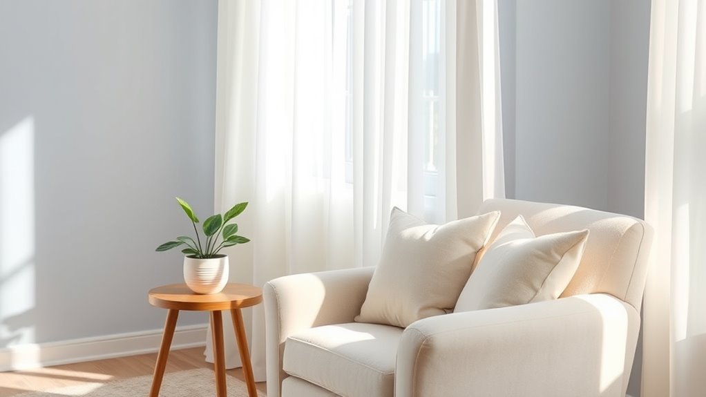
Choosing the right colors can considerably help calm individuals with dementia and reduce their anxiety. When you select soothing hues for their environment, you’re not just decorating—you’re creating a space that promotes peace and comfort. Research shows that certain colors can influence mood, behavior, and even physiological responses, making them powerful tools in dementia care. Soft, muted tones like blues, greens, and warm neutrals tend to have a calming effect, helping to lower agitation and promote relaxation. Bright, vibrant colors, on the other hand, might overstimulate or confuse, so it’s best to use them sparingly or for specific purposes, such as highlighting important objects.
Blue is widely recognized for its calming qualities. It’s often associated with tranquility and can help reduce feelings of agitation. When you incorporate shades of blue into the environment—perhaps through wall paint, bedding, or accessories—you create a serene backdrop that can soothe restless minds. Green, linked to nature, has similar calming effects. It can evoke feelings of safety and balance, making it an excellent choice for areas where your loved one spends time. Warm neutrals like beige, taupe, or soft browns also promote comfort and familiarity, reducing stress by providing a sense of stability. These neutral hues serve as a gentle canvas, allowing other calming elements to stand out without overwhelming the senses.
The key is to keep the color palette simple and consistent to avoid confusion. Sharp contrasts or overly complex patterns can be disorienting, so opt for subtle variations and smooth progressions between shades. For example, using slightly different shades of blue or green in different rooms can create a cohesive environment that feels familiar and secure. When choosing colors, also consider the individual’s preferences and history. If your loved one has a favorite color or a positive association with a particular hue, incorporating that into their space can evoke feelings of happiness and comfort. Additionally, lighting quality plays a significant role in how colors are perceived, as good lighting enhances soft colors and creates a welcoming atmosphere. Natural light enhances soft colors, making spaces feel more open and inviting. Conversely, poor lighting can distort colors and create shadows that may increase confusion or fear. Hence, ensure your environment is well-lit with natural or warm artificial lighting to complement the calming color scheme. By thoughtfully applying these principles, you help foster an environment where your loved one feels safe, relaxed, and more at ease in their daily life.
Frequently Asked Questions
Are There Specific Colors That Should Be Avoided for Dementia Patients?
You should avoid using overly bright or harsh colors like red or neon shades, as they can cause agitation and confusion in dementia patients. Avoid complex patterns or contrasting colors that may be overstimulating or confusing. Instead, stick to soothing, muted tones like soft blues, greens, or gentle earth tones, which help create a calming environment. Keeping colors simple and consistent can make a significant difference in reducing anxiety.
How Do Personal Preferences Influence Calming Color Choices?
Imagine choosing a favorite song; personal preferences shape calming colors just like music. Your loved one’s favorite colors can make them feel more at ease, so consider their past tastes. Research shows that personalized color choices can reduce agitation and promote comfort. You should involve them in the selection process, observing their reactions, because what soothes one person might not work for another. Tailoring colors to individual preferences truly makes a difference.
Can Lighting Affect the Calming Effects of Color in Dementia Care?
Lighting markedly influences the calming effects of color in dementia care. When you use soft, warm lighting, it enhances soothing colors, creating a peaceful environment that reduces agitation. Bright or harsh lighting can diminish these calming effects, causing discomfort or confusion. You should aim for balanced, gentle lighting to support the calming properties of chosen colors, helping individuals feel more secure and relaxed in their space.
What Role Does Cultural Background Play in Color Perception and Calming?
Your cultural background greatly influences how you perceive and respond to colors, affecting their calming effects. Different cultures associate colors with specific emotions or meanings, which can enhance or diminish their soothing qualities. When caring for someone with dementia, consider their cultural context to select colors that resonate positively. By understanding these cultural nuances, you can create a more calming environment that aligns with their personal associations and comfort levels.
How Can Caregivers Assess Which Colors Are Most Effective Individually?
You can assess which colors work best by observing your loved one’s reactions, noting their comfort, calmness, or agitation. Try introducing different calming shades—like soft blues or gentle greens—and monitor their responses over time. Keep in mind their preferences, cultural background, and past experiences. Adjust as needed, and stay attentive to subtle cues, fostering an environment that promotes peace and reduces stress through personalized color choices.
Conclusion
By choosing calming colors, you create a soothing environment that eases dementia symptoms, like a gentle breeze calming a restless breeze. These hues act as a visual sanctuary, helping reduce anxiety and confusion. Remember, your thoughtful color choices can transform a space into a peaceful haven, guiding your loved ones toward comfort and security. With each calming shade, you paint a brighter, more reassuring world where they can feel safe and at peace.