To make art and accent walls low-vision friendly, use bold, high-contrast colors like bright reds, deep blues, or vivid yellows. Opt for simple shapes and striking visuals that convey meaning quickly, avoiding intricate patterns or fine lines. Incorporate tactile cues or textures to add depth and differentiation. Proper lighting, like adjustable focused fixtures, enhances visibility without glare. Keep spaces uncluttered and accessible. Continue exploring for more ideas to create an inclusive environment.
Key Takeaways
- Use bold, high-contrast colors and simple shapes in artwork to improve visibility and quick recognition.
- Incorporate textured finishes and tactile cues in walls and art for enhanced sensory engagement.
- Position art and accent walls in accessible, well-lit areas free of clutter and tight spaces.
- Employ adjustable, focused lighting to highlight features without causing glare or shadows.
- Select accent wall colors that sharply contrast with surrounding surfaces to guide focus and improve clarity.

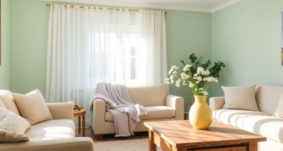
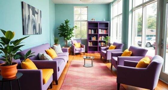
Creating a space that’s welcoming for everyone involves more than just good lighting and comfortable furniture. When designing a room with low-vision individuals in mind, it’s essential to think about how visual elements can be both accessible and engaging. Art and accent walls play a crucial role in this, offering visual interest without overwhelming the senses. To make art truly inclusive, choose pieces with bold, high-contrast colors that stand out sharply from their backgrounds. Bright reds, deep blues, and vivid yellows can help create clear distinctions, making it easier for someone with low vision to appreciate the details. Avoid artwork with too many fine lines or intricate patterns, as these can be confusing or difficult to interpret. Instead, opt for bold, simple shapes or images that convey meaning at a glance.
When selecting colors for your accent wall, contrast is key. A dark-colored wall paired with light-colored art creates an immediate visual focus, guiding the eye naturally to that area. Conversely, if you prefer a lighter wall, incorporate darker, more saturated artwork or features that pop against the background. Textured finishes, like matte or semi-gloss paint, can add depth and help differentiate surfaces, providing tactile cues that complement visual cues. You might also consider using different textures or materials in the art itself—such as raised elements or mixed media—that add a tactile dimension, making it easier for someone with low vision to engage with the space.
Lighting also plays a vital role in enhancing the visibility of art and accent walls. Use adjustable, focused lighting like track lights or wall-mounted fixtures to highlight your chosen features. Avoid harsh, direct lighting that can cause glare, which may obscure details or create discomfort. Instead, aim for even, diffused light that accentuates contrasts and textures without overwhelming the senses. Remember, consistent lighting helps maintain clarity and reduces shadows, making it easier for individuals with low vision to navigate and appreciate their environment. Incorporating high-contrast color schemes in your design can significantly improve visual clarity and accessibility for low-vision users.
Finally, keep the overall layout simple and clutter-free. Position artwork and accent walls in accessible locations, avoiding corners or tight spots that are hard to reach or see clearly. Use clear, unambiguous signage or labels if needed, and ensure pathways are unobstructed, well-lit, and easy to navigate. By thoughtfully combining contrast, texture, lighting, and strategic placement, you create a space where everyone, regardless of visual ability, can feel comfortable, engaged, and inspired to enjoy the art and design around them.
Frequently Asked Questions
How Can Color Contrast Improve Low-Vision Accessibility?
Color contrast improves low-vision accessibility by making objects, signs, and pathways stand out clearly against their backgrounds. When you use high contrast, it becomes easier to distinguish different elements, reducing confusion and enhancing navigation. You can achieve this by choosing colors with significant differences in brightness or hue. This way, people with low vision can move safely and independently, improving their overall experience and accessibility in any space.
What Materials Are Best for Tactile Art Displays?
You should choose textured materials like raised rubber, silicone, or carved wood for tactile art displays, as they provide clear, distinguishable surfaces. Did you know that studies show tactile recognition improves by up to 60% with varied textures? You’ll want to prioritize durable, non-slip surfaces that are easy to clean and maintain, ensuring accessibility and engagement for individuals with low vision. Your tactile displays should invite touch and exploration, enhancing inclusivity.
Are There Specific Lighting Tips for Low-Vision Art Areas?
You should use bright, even lighting with minimal shadows to enhance visibility in low-vision art areas. Opt for LED lights with high color rendering indices and adjustable brightness to adapt the lighting to individual needs. Position lights to avoid glare and ensure they illuminate the artwork directly. Consistent, well-placed lighting helps you better appreciate details, textures, and contrasts, making the art more accessible and enjoyable.
How Can Artwork Be Positioned for Easier Viewing?
You should position artwork at eye level, about 57 to 63 inches from the floor, to make it easier to view. Use bright, even lighting without glare, such as adjustable track lights or wall-mounted fixtures. Avoid placing art in areas with shadows or direct sunlight. Keep pathways clear and guarantee the artwork is well-lit from multiple angles, helping those with low vision appreciate the details comfortably.
What Are Some Budget-Friendly Low-Vision Wall Design Ideas?
You can create budget-friendly low-vision wall designs by using bold, contrasting colors to make features stand out clearly. Consider simple patterns or large, high-contrast artwork that’s easy to see from a distance. Using inexpensive paint or wallpaper with strong contrasts, and adding tactile elements like textured wall stickers, can enhance visibility without breaking the bank. These ideas make your space more accessible while keeping costs low.
Conclusion
By incorporating bold, high-contrast art and accent walls, you create a space that’s easier to enjoy, almost like lighting up a dark room. These features guide your eyes, making your environment more engaging and accessible. Think of it as giving your home a friendly handshake—welcoming and clear. With simple tweaks, you make your space not only beautiful but also more comfortable for everyone with low vision. Your effort transforms your home into a brighter, more inclusive sanctuary.