
To balance patterns and neutrals in décor, focus on creating harmony through cohesive color palettes and thoughtful textures. Use bold patterns as focal points while grounding them with neutral walls and accessories. Mix textures like plush velvet with sleek metal to add visual and tactile contrast. Keep the style aligned with your desired mood, whether cozy or modern. Mastering this balance results in a space that’s lively yet calming—discover more tips as you explore further.
Key Takeaways
- Use neutrals as a calming backdrop while incorporating bold patterns as focal points.
- Balance textures by mixing soft, plush materials with sleek, hard surfaces for visual interest.
- Coordinate patterns and colors within a cohesive palette to maintain harmony and prevent visual clutter.
- Consider the desired mood—cozy or modern—when selecting textures, colors, and pattern scales.
- Practice restraint by highlighting patterns selectively and grounding the design with neutral elements.
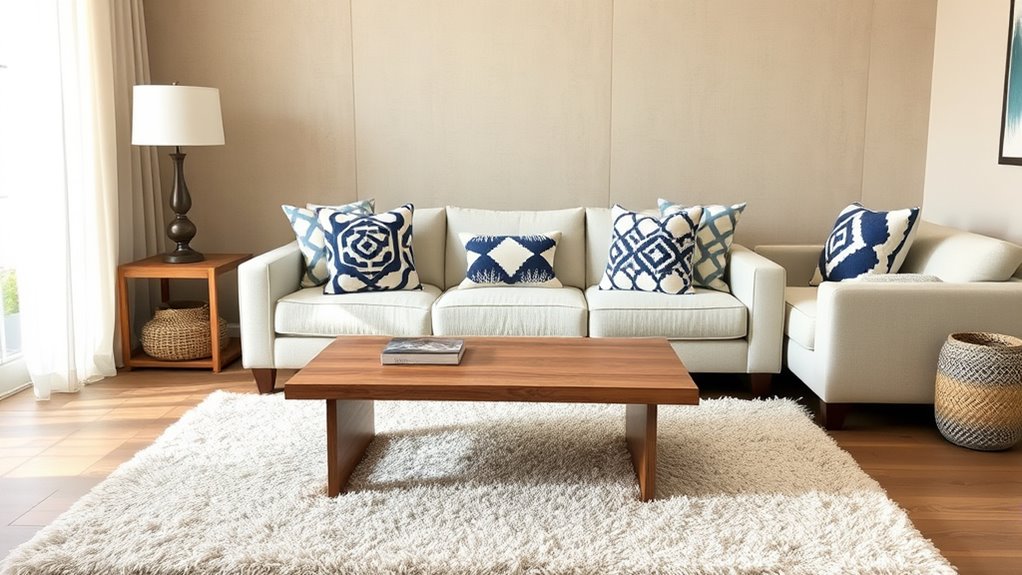
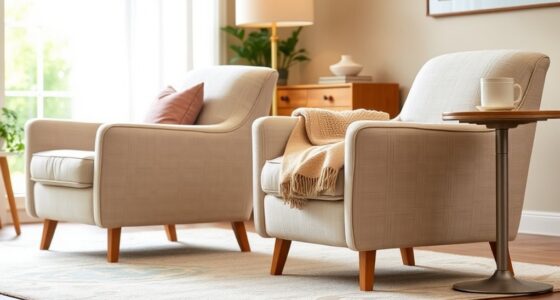
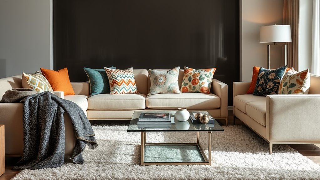
Balancing patterns and neutrals is essential for creating a stylish and harmonious interior. When you’re designing a space, it’s all about finding the right mix of visual interest and calming simplicity. Mixing textures and color coordination play a critical role in achieving this balance. By thoughtfully combining different textures, you add depth and dimension to your room, ensuring it feels inviting rather than chaotic. For example, pairing a plush velvet sofa with a sleek metal coffee table creates a tactile contrast that keeps your space engaging. Incorporating varied textures—like woven baskets, soft throws, or smooth ceramics—lets you play with visual weight and sensory experience, preventing your decor from looking flat or monotonous. Regularly assessing and rotating items can help maintain this balance over time and prevent clutter buildup. Color coordination is equally important. When you mix patterns, it’s best to stick within a cohesive color palette. This doesn’t mean everything has to match perfectly, but your patterns should complement each other through shared hues or tones. If you choose a bold floral pattern with a vibrant color palette, balance it out with neutral walls or accessories in subtle shades like beige, taupe, or gray. This helps your patterned pieces stand out without overwhelming the room. Conversely, if you opt for more subdued patterns, adding a splash of bright color through decorative pillows or artwork can energize the space. The key is to maintain harmony between your patterns and neutrals, ensuring they work together rather than compete. When you’re mixing textures and colors, keep in mind the overall mood you want to create. If you prefer a cozy, inviting atmosphere, incorporate warm neutrals and soft textures like chenille or wool. For a modern, sleek look, blend cool neutrals with smooth, shiny surfaces such as glass or polished wood. Don’t forget that pattern scale matters too—large patterns can dominate a room, so balance them with smaller, more subtle designs. This creates a rhythm that guides the eye naturally across your space. Additionally, integrating vertical storage solutions can help you organize patterns and neutrals effectively, keeping your space tidy and visually appealing. Ultimately, the secret to balancing patterns and neutrals is restraint and intention. Use your patterns as focal points, while neutrals serve as a grounding backdrop. Pay attention to how textures interact, ensuring your color choices tie everything together. When you master mixing textures and color coordination, you craft a space that feels thoughtfully curated, lively yet calming, and uniquely yours. It’s about creating a visual narrative that strikes the perfect harmony between boldness and serenity, making your interior both stylish and welcoming.
Frequently Asked Questions
How Do I Choose the Right Pattern-To-Neutral Ratio?
To choose the right pattern-to-neutral ratio, start with neutral dominance, making your space feel calm and cohesive. Incorporate patterns with varied scales—large, medium, and small—to add visual interest without overwhelming. A good rule is 60% neutrals and 40% patterns, adjusting based on your style. Keep the pattern scale balanced, mixing bold with subtle designs, so your décor feels lively yet harmonious.
Can I Mix Bold Patterns With Subtle Neutrals Effectively?
Yes, you can mix bold patterns with subtle neutrals effectively. Think of pattern mixing like a jazz band—bold patterns add energy, while neutrals provide harmony. I once decorated a living room with a large, vibrant rug paired with soft beige cushions, creating a lively yet balanced space. When you combine striking patterns with neutral pairing, you achieve visual interest without overwhelming, making your décor both dynamic and cohesive.
What Are Common Mistakes When Balancing Patterns and Neutrals?
You often make the mistake of causing a pattern clash by using too many bold patterns without enough neutral to ground the look. Also, avoid neutral overload, where the space feels bland and lacks visual interest. To balance effectively, guarantee your patterns complement each other and are broken up with neutral elements. This keeps your décor lively without overwhelming the senses, creating a harmonious and stylish space.
How Do Lighting Conditions Affect Pattern and Neutral Balance?
Imagine a soft glow that gently whispers secrets to your space. When natural light floods your room, it brightens neutrals, making patterns pop subtly, so balance feels natural. Artificial lighting, however, can cast warm or cool hues that shift the visual harmony, sometimes overpowering delicate patterns or muting neutral tones. Adjust your lighting to enhance your décor’s balance, creating a cozy, inviting ambiance that feels just right.
Are There Specific Color Schemes That Work Best With Neutrals and Patterns?
You should choose color palettes that enhance both neutrals and patterns, like soft earth tones or muted shades, to create harmony. Bold, contrasting colors can make patterns pop, while harmonious, monochromatic schemes guarantee a seamless style coordination. Consider your overall décor style—modern, rustic, or traditional—and select a color scheme that complements this aesthetic. This approach helps balance patterns and neutrals, making your space feel cohesive and inviting.
Conclusion
By balancing bold patterns with soothing neutrals, you create a space that feels both lively and calm. It’s like a dance between energy and serenity, where each element complements the other rather than competing. Embrace the contrast, and your décor becomes a reflection of harmony—dynamic yet peaceful. In the end, it’s this delicate interplay that transforms your space into a sanctuary that’s as interesting as it is inviting.