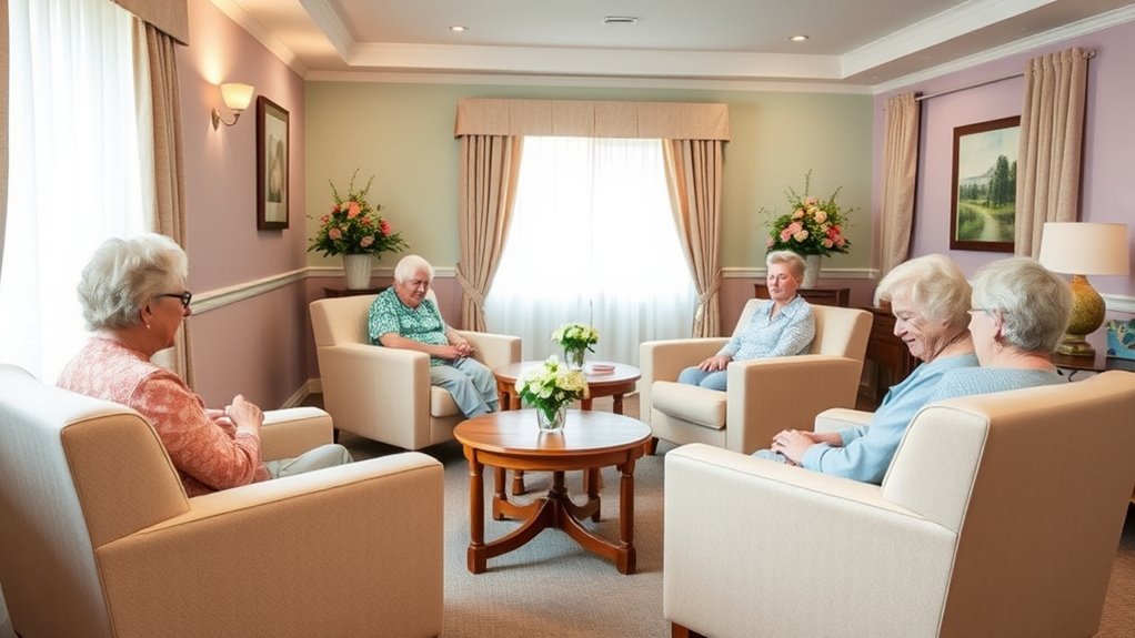

Using soft colors in dementia units helps create a calming environment that reduces agitation and promotes emotional well-being. Gentle hues like pastels and warm neutrals can ease anxiety, improve orientation, and make residents feel safe. These colors work with lighting and textures to foster a sense of familiarity and comfort. By choosing the right calming palette, you support residents’ sensory needs and encourage positive behaviors. Keep exploring to discover more ways to enhance harmony and comfort in these spaces.
Key Takeaways
- Soft, muted hues create calming environments that reduce anxiety and promote relaxation for residents with dementia.
- Using tranquil colors like pastel blues and greens helps minimize confusion and emotional distress.
- Soft colors reflect light gently, decreasing glare and harsh shadows to enhance visual comfort and orientation.
- Integrating gentle hues with appropriate lighting and textures supports sensory stimulation and environment harmony.
- Strategic use of soft colors, considering budget and sustainability, ensures long-term comfort and safety in dementia units.

Designing dementia units with soft colors can substantially enhance residents’ comfort and reduce agitation. When you choose gentle, muted hues for walls, furniture, and decor, you’re tapping into the principles of color psychology, which directly influence mood and behavior. Soft colors like pastel blues, warm beiges, and gentle greens are known to create calming environments that ease anxiety and promote relaxation. These hues help residents feel safe and secure, which is essential in dementia care settings. By carefully selecting these soothing shades, you can foster a peaceful atmosphere that minimizes confusion and distress, making daily routines smoother for both residents and staff.
Understanding how color psychology impacts mood allows you to intentionally design spaces that support residents’ emotional well-being. Bright, vibrant colors might overstimulate or confuse individuals with dementia, leading to increased agitation. In contrast, soft colors provide a visual calmness that can help residents stay centered. When residents are surrounded by colors associated with tranquility, their brains are less likely to register overwhelming stimuli, which reduces agitation and emotional outbursts. This thoughtful approach to color choice isn’t just about aesthetics; it’s a strategic way to influence behavior positively and create a more harmonious environment.
Sensory stimulation plays an essential role in dementia care, and soft colors are an effective tool for managing it. You want residents to engage with their surroundings without feeling overwhelmed. Gentle, muted tones serve as a form of visual sensory stimulation that’s soothing rather than stimulating. They help residents focus and orient themselves without the distraction of harsh or jarring colors. Incorporating soft colors into different elements of the unit—such as walls, flooring, and furnishings—can subtly guide residents through the space, aiding orientation and reducing confusion. This careful use of color helps residents process their environment more comfortably, encouraging engagement without overstimulation.
When designing with soft colors, consider the overall sensory experience of the space. Texture, lighting, and color work together to create a cohesive environment that supports residents’ needs. Soft colors reflect light gently, preventing glare and harsh shadows that can startle or disorient. Proper lighting, combined with calming hues, enhances sensory comfort and promotes a sense of familiarity. As you plan these spaces, keep in mind that the goal is to craft an environment where residents can feel safe, relaxed, and engaged, all while minimizing agitation. Using soft colors thoughtfully influences how residents perceive and interact with their surroundings, ultimately improving their quality of life in dementia units.
Additionally, understanding the importance of financial aspects, such as budgeting for appropriate materials and lighting, can help ensure that the design remains sustainable and effective over time.

Momcozy Universal Stroller Organizer with Insulated Cup Holder Detachable Phone Bag & Shoulder Strap, Fits for Stroller Like Uppababy, Baby Jogger, Britax, BOB, Umbrella and Pet Stroller
- Structured Organizer with Multiple Pockets: Internal multi-functional partition design
- Insulated Cup Holders: Includes 2 insulated cup holders
- Large Capacity Storage: Fits essentials like phone, wallet, and more
As an affiliate, we earn on qualifying purchases.
Frequently Asked Questions
How Do Soft Colors Affect Residents With Visual Impairments?
Soft colors help residents with visual impairments by enhancing their color perception and reducing visual confusion. You should consider lighting considerations to guarantee colors appear gentle and clear, preventing overstimulation or difficulty distinguishing objects. By choosing the right soft hues and adjusting lighting, you create a calming environment that supports residents’ visual comfort and orientation, making it easier for them to navigate and feel secure in their space.
Are There Specific Soft Color Palettes Recommended for Dementia Care?
Think of soft color palettes as a gentle sunrise—calming and welcoming. For dementia care, choose muted blues, soft greens, and warm beiges, which align with color psychology to reduce agitation and promote comfort. Stick to well-coordinated shades to avoid visual chaos. These palettes create a soothing environment, helping residents feel safe and relaxed. Your goal is harmony through thoughtful color coordination that enhances their well-being.
How Do Soft Colors Influence Staff Mood and Productivity?
Soft colors can boost your staff’s mood and productivity by creating a calming environment. When you use decorative accents in gentle hues and maintain color consistency throughout the space, it reduces stress and distractions. This harmony helps staff focus better and feel more relaxed, leading to improved care. By intentionally choosing and applying soft colors, you foster a positive atmosphere that benefits both staff and residents.
Can Soft Colors Help Reduce Anxiety During Transitions or Activities?
Soft colors can definitely help reduce anxiety during shifts or activities. When you use gentle hues with proper color contrast, residents feel more comfortable and less overwhelmed. The subtle shades create a calming environment, easing their nerves and promoting resident comfort. By thoughtfully choosing soft colors, you make transitions smoother and help residents feel more secure, ultimately supporting their well-being during change.
What Maintenance Is Required to Keep Soft Colors Looking Their Best?
To keep soft colors looking their best, you should regularly clean the walls with a gentle, non-abrasive cleaner to prevent dirt buildup and sustain their calming effect. Watch out for color fading over time; if it occurs, consider touch-ups or repainting with high-quality, fade-resistant paint. Routine maintenance like these ensures the environment remains soothing and visually appealing for residents with dementia.
Conclusion
By choosing soft colors for dementia units, you create a calming environment that reduces agitation and promotes comfort. Studies suggest gentle hues can improve mood and orientation, helping residents feel more secure. Trust the theory that soothing colors support emotional well-being, making your space more welcoming. Incorporating these hues isn’t just a trend—it’s a simple yet effective way to enhance quality of life. So, embrace soft colors and see how they make a meaningful difference every day.